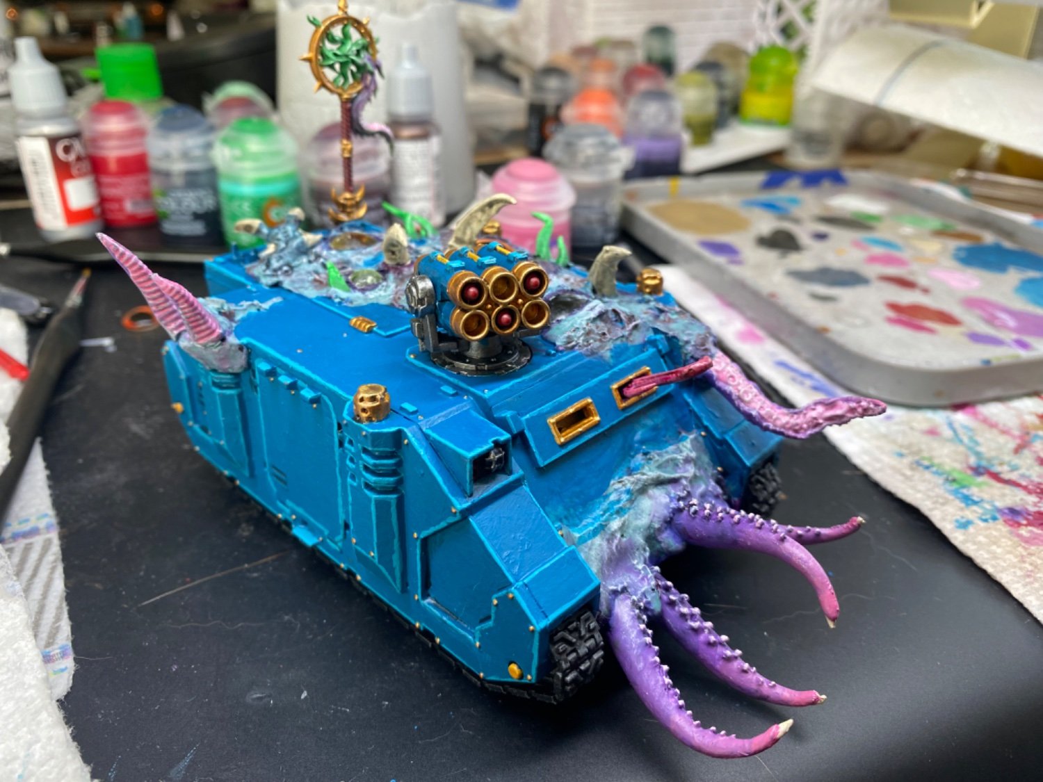
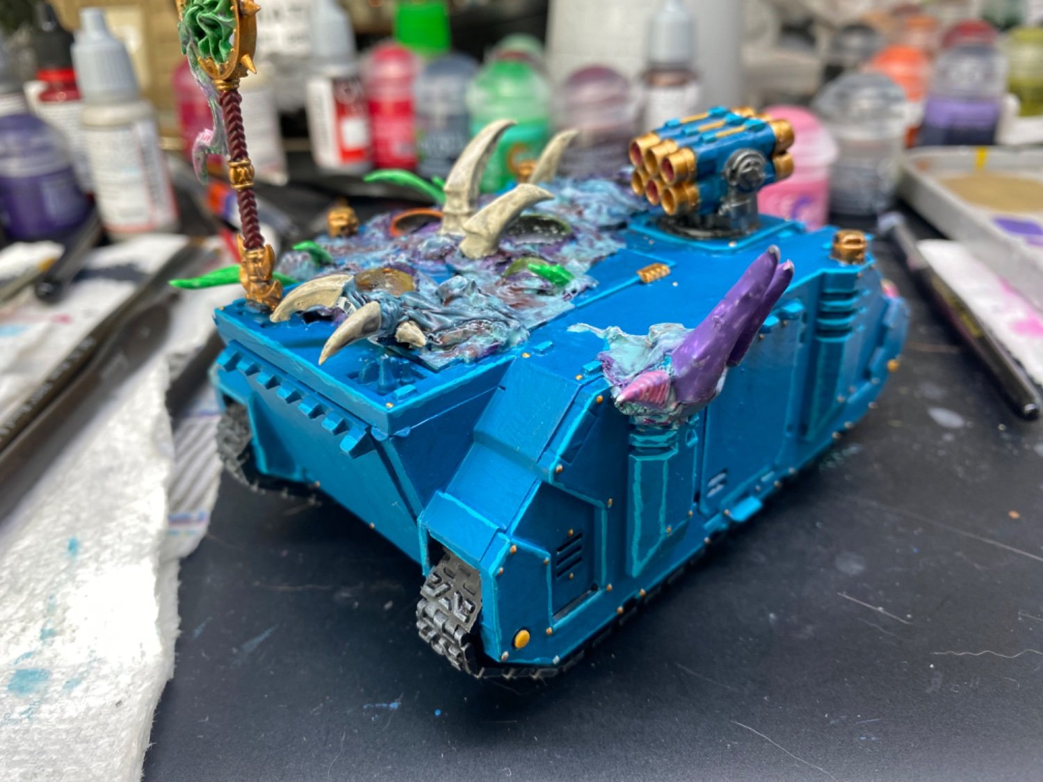
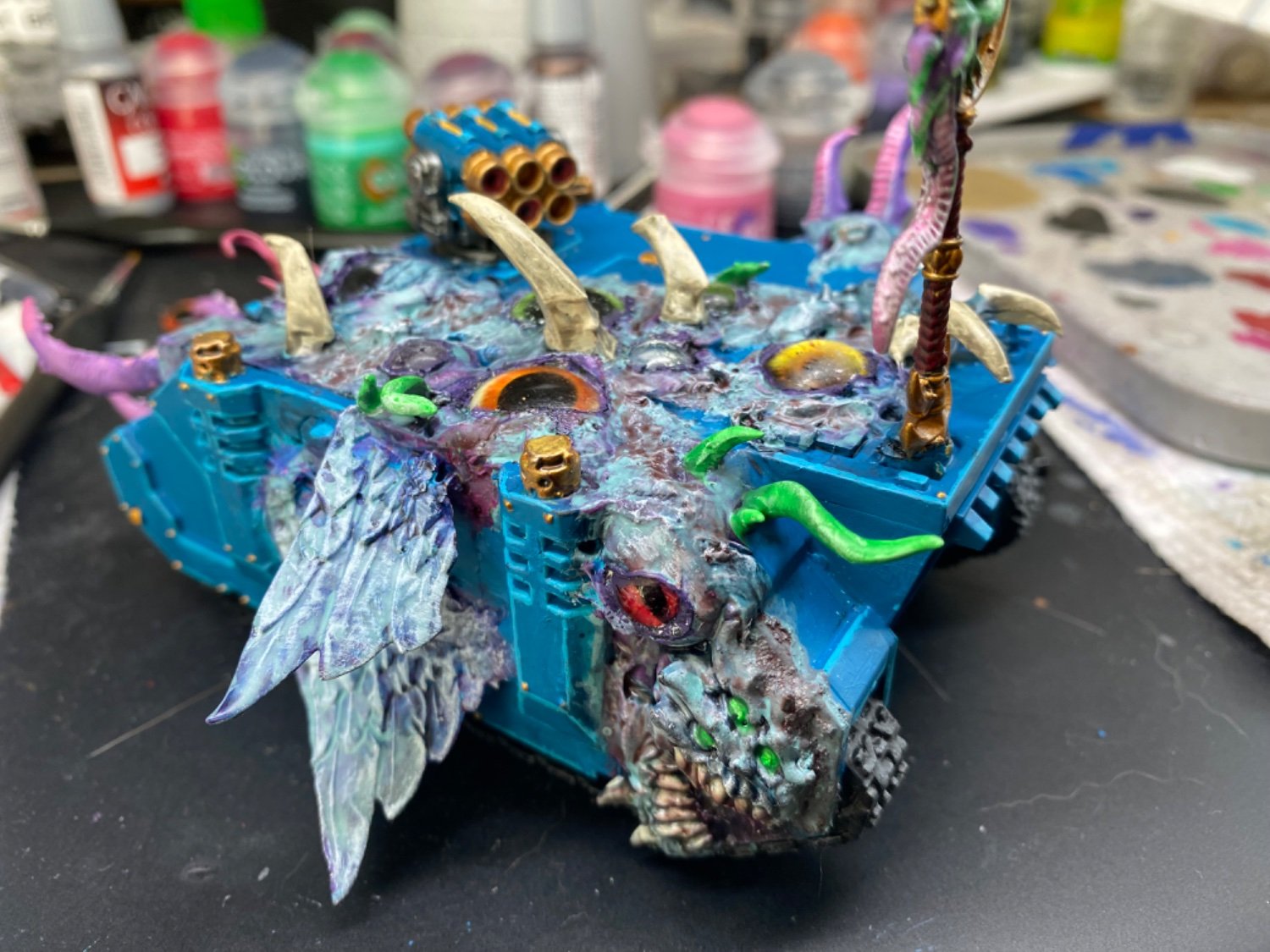
Looking at it, I feel like it kinda looks like I just slapped on random bits and milliput. I did, but I want it to look more purposeful/part of the piece.
I watched Midwinter Mini’s video for the nurgle land raider and used much of that for inspo. I really wanted the PVA+Superglue trick to work but it did not come out as nice for me. I thought about adding more and just not painting it, but a bit worried about slapping that on miiiight be too much?
If anyone has any advice to make it look more like a flesh change or parts erupting from the metal (or any other advice to elevate this) I would greatly appreciate the guidance.
For a good “parts erupting” effect, you need the broken edges of the armor to surround the erupting nodule. Take a look at Death Guard models for inspirations.
Normally, the bent/broken armor is done in the initial build phase by literally breaking pieces and bending the plastic (heat them up s little first when bending). As an add-on here? You could sculpt it out of green stuff.
Make a 2mm thick ribbon of green stuff roughly 8mm wide. Cut a jagged edge down the middle to make two strips. Blend the smooth edge into the existing armor plate while having the jagged edge rest on your model’s bulbous flesh and tendrils. If you can, curl the jagged edge away from the growth.
Ah that makes so much sense, hopefully I can sculpt something convincing, prime it, and glue it on. Thank you!
I think tumors would take it more over into Nurgle territory (as your MidWinter tutorial reference is). I like a lot where you’ve already gone with the tentacles and other details.
If you want some more chaos greeble, perhaps airsoft BBs into masses of greenstuff, with the BBs painted as eyes.
Something as simple as shading the border between the mutation and the armor with agrax earthshade would make it pop better. The armor and mutation being similar shades of blue make it blend together. Marking the border with more distinct shading would help I think.
At one point I had it as a super fleshy pink thinking that might sell it better, but ended up reverting it. Thought keeping the colors close would help me more. Maybe after sculpting some broken armor around it I’ll give that another shot

I honestly think that looks better. More obvious it’s something other than the vehicle and not just a very lumpy rhino at a glance/across the table.
Ah man, perhaps I’ll revisit again. Thanks for your input!
Would be cool if there were spots that metal is bulging pre-burst


If that thing don’t got eyes how’s it gonna see


