
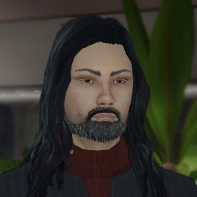
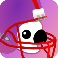
This bird is full of symbolism:
- Birds represent freedom, hope, etc.
- Also, as a way to represent the people who “flew away” from Reddit.
- The bird is from Oceania, sounds silly but is not a animal commonly found in nature outside that place, meaning it evokes foreignity for a part of the userbase here.
- C’mon guys, is a Cacatua, it can’t get cooler than that…
This is so cool unironically
- birds also love to talk!
I am 1000% behind anything with a bird on it.
Ever been to Portland?
No, but I do hear they like to put birds on things.
Cockatoos are also loud, obnoxious, but extremely intelligent, which feels fitting too.
This is such a great explanation man. Now tell me, how do you collapse comment threads?
I don’t think there’s a way to do it by default but, if you use userscripts, there’s one for collapsing comments.
No offense, but what is wrong with the current icon? The purple folder looks great.
A mascot is not necessarily an alternative to an icon - they can coexist. A few people just like having a mascot for software projects, similar to the lemming of Lemmy or the Reddit alien. :)
Think O’Reily book covers. There’s always some associated animal with a particular tech stack
A folder isn’t “fun.” Like, reddit has the Snoo alien or whatever, and they went the extra mile of letting users represent themselves with custom Snoo avatars made up of preset parts like a character creator. It’s fun, and having a mascot here would be fun too.
Reddit does have that… and it was implemented in like… Reddit’s 10th year of operation. It’s not a priority.
Looks a bit microsofty to me, tbh. Like it’s another app in the office suite.
/u/fixedfun 's parrot is more lighthearted. Like the snapchat ghost or twitter bird.
Apparently there’s a kbin app in development. Don’t feel the folder thing is a good fit for an app tile tbh.
Yeah, but the kbin app already has a logo, it looks like a little bow and arrows. Or maybe the bow is a moon? It has arrows. I find the various elements questionably sized in relation to each other, but aside from that I like it.
Though tbh, if it somehow didn’t, I’d be happy with the folder symbol. I think where logos are concerned, likely I just really like simple designs and dislike animals
Artemis is a third party app.
I believe the Artemis logo is a play off the NASA space program. It looks like a spaceship going out into space or a similar theme.
I couldnt put my finger on it, but “Microsofty” really clicked. I feel like Ive seen the Kbin logo as a folder icon in linux icon packs.
Dont get me wrong, Its not a bad logo imo. But if I have to be nitpicky, I’d like something more unique such as this bird.
As others have said… a mascot.
But, what would be great in my opinion would be the current folder icon shape stylized like a birds wings.
E.g. flying free amongst the various places of the fediverse
…Oh. We may reach common ground here. I think I like that.
Only downside is the propensity for people to equate it with that trash pigeon meme since they’re both purple birds. Am I discounted for having liked the trash pigeon meme?
Needs to be the pouch of a Kangaroo or other marsupial.
Adama is right, I mean a mascot not an app icon, I just put it in an app background, just because. Lemmy has the mouse I think is a mouse, Reddit the Snoo, Kbin could have the Kbird.
If it incorporated the folder icon into the animal I would love it. The icon is like a shorthand version of it. A kangaroo or koala bear with a pouch that is folder like. WHY a bird?
https://media.giphy.com/media/l0K469pnf9MH9ktDa/giphy.gif
Kbin terrorizing Spez.
Not sure about others, but I feel that the bird would be better for bringing in new users who made not be as tech inclined versus the folder. The name “kbin” already has some tech connotations to begin with. For the average user, thinking of a bird when they see the app would probably be better versus the windows file explorer or some MS office/development app. The folder icon doesn’t have to be trashed though, as stated, they can coexist.
I, too, prefer the design on the left; however, If I may make a suggestion, I would flip it horizontally so the bird faces the right. As you know, western printed language flows from left to right; from a design perspective, the aesthetic of right-facing imagery subtly implies a “forward” direction, or moving forward to the future. Considering the purpose of this icon in this new frontier, I think that would be appropriate.
Fantastic design, and I think the subtle gradient you dropped in the background is a nice touch.
I don’t think Kbin needs a mascot. It needs to be its own thing rather than just a reddit 2.0.
I think Kbin does need a mascot, like everything has a mascot. For Tesla you got the T Logo thing, for Facebook you got the F Blue, for Twitter it’s a white Bird
Just my opinion tho
You mean like this one?
I keep thinking that should be a logo for a Vbin instead
But…the letter T isn’t a mascot. None of those are mascots. They’re logos.
I understand the need to lay claim to a place meant for individualized communication, but I’m personally a little annoyed by the insistence of it. I’m not interested in cute squishy mascots. Having a fun animal as the face of anything reminds me of every lame corporation’s attempts to look appealing.
I recognize there’s little to no way I’m going to win this fight, but it’s in the same vein as the continual server-specific nickname suggestions for functionally the same userbase speaking in the same shared forums.
I think we’re doing it because we’re used to seeing companies do it, a la every one of them you mentioned. A bunch of us probably liked the Snoo, snoo was cute. It makes sense for newly ex-redditors to immediately remake their own snoo that is theirs and theirs alone and way better than the stinky reddit snoo.
Being used to your company of choice having customer friendly anthro mascots and tribalistic nicknames doesn’t make it something we need, and that I intended to leave all of that behind when I left isn’t helping my bias in this.
Especially where site-wide symbols like the ones you cited are concerned. I don’t think I’m going to end up liking anything that’s chosen simply because the kbin logo is already kbin, it was here when I got here, and I genuinely think it’s really snazzy. Kudos to the designer who took two things I passionately hate — minimalist artwork and the color purple — and combined them into something enjoyable
Ehhh i can see your point but i still think a Symbol for Kbin, a logo, a mascot or anything is absolutely beneficial for Kbin as a whole. People need a symbol to stand behind, a Simple and Recognizable Symbol for Kbin would benefit Kbin as a whole, not to mention it would give tiny bit of content to Kbin as people will discuss about the Logo, will draw the Logo, stuff like that.
Besides the Current Kbin Logo looks great already
You know, I was debating whether I was in favor or against a mascot but your comments convinced me that we do need one. All hail the bird!
It would drive interaction, admittedly. As a thing apart from the site logo, I think since it would be a lasting symbol that does promote identity, it has to be chosen with care and that’s basically impossible to do with kbin. One cannot anthropomorphize a folder, lest we create a horrifying new age version of Clippy. And nobody wants those kind of night terrors.
This probably adds a lot to my dislike of every option I’ve seen. There really are none that aren’t randomly chosen because the artists likes lizards or something, so they never feel like they fit. Like. I don’t mind beehaw’s hive theme because it’s in the name, but I’d mind it here.
Take in mind a lot of magazines still have the Snoo in their icons, if you want migration a simple, oh in Kbin you replace the Snoo with X should be sufficient. This wouldn’t be in mind if the Snoo wasn’t still so prevalent here.
tesla has a dog nose and it annoys the crap out of me. how does a dog nose connect to the invention of electricity in any way? it’s not thematic at all. should have been a tesla coil.
Dogs ain’t the only animals with noses, sorry.
Haha, I can’t unsee that now.
I prefer the folder icon kbin already has.
You just know people are going to make “parroting” jokes about reposts if this becomes the mascot ^^
I think that’s more of a selling point to me, honestly.
I wonder how it would look with a kakapo, since that is also a k-bird, and a fairly well-known one at that. (Along with having a friendly-looking face)
Having a cute moss chicken for a mascot would be cool.
I’m partial to the Kookaburra.
If the community wants a mascot, the one on the left is certainly not a bad choice
I don’t think kbin needs a mascot, but if it gets one, this should be it! I really like the design on the left, though I would try adding the white reflection from the one on the right.
Birds are cool. If we are voting between the two, then I like the left one.
I kinda like the right one tho
I’m not fussed. Flying can openers are fine. Left preferred. Right one looks like a ghost just got out of the shower.
I’m happy with the folder too, but appreciate you’re aiming for a less tech oriented audience.
Right one looks like a ghost just got out of the shower.
I’ll never unsee that now. Why would you just say things like that out loud
I prefer the one on the left, but think it might be cool with one of the signature raised crests that make the bird unique .
I love it! I like the left one
I like the idea of a kbird.
I agree with people saying it should look towards the right.
I’m also fine with the general design idea of the one on the left but if this the final work, I will hard pass as the line work is extremely sloppy. Good for a first draft though.
Edit: I’m really sorry if this is worded a bit harshly. I really love the idea behind the mascot and the general design language. I just have experience with design, not as a designer but a project manager, so I am sensitive to technical details. Line work and shape language are vague but extremely important parts of logo -or mascot in this case- design. Once the design on the left gets a professional polish pass to finalize it, it should work great.
I would pay attention to line weight, as they are too skinny right now for the size of the bird, too many sharp corners creating a less welcoming shape language than I’d like, and line intersections aren’t clean, disturbing the flow. The little bump on the back of the head looks a bit like someone gave the poor bird a whack rather than the natural shape of its head for example.
Spike the 25 year old cockatiel approves!
Agree with some others that the left birb will scale better.
Hi Spike! Unrelated but I’m trying to get m/parrots up and running as a Reddit defector 🥰 Come join Marty!
Done. Marty is a handsome devil.


