Love the new look!
Guess I’m in the minority, but I think it’s a big improvement over the last icon! Looks much more modern.
Agreed, stands out a lot better in my app drawer too 😄
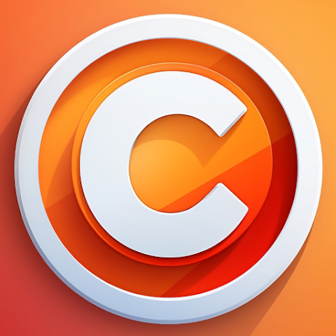
Looks too much like the copyright symbol to me.
Yea. Exactly like the copyright symbol. There’s not really any connection to lemmy so it’s confusing. I liked the old one better.
I’m sorry, but I’m not a fan. It’s too busy, and the 3D design makes it look like an app from 2012.
But it looks better than the last 3 imo
2012 was a better time, though. I miss when everything wasn’t plain & flat.
(I’m mostly fine with the icon, though it kind of conjures images of crypto bros)
This is better, but tbh, I don’t like either logo. Both are too busy, imo.
I don’t normally have OCD or anything, but that weirdly lopsided but still somehow externally circular “C” is making my brain hurt.
I like it, blends in more with other app icons. Flatten from 3d by removing all the shadows an dit might look a little less distracting
My favorite one so far!
The old icon was may better, this new one has way to much orange in it
Was this created via AI? It looks kind of… off to me. I think it’s a combination of multiple factors - the ‘c’ is a bit wonky looking and has this strange rim lighting around it that doesn’t really make much sense. Also, the cast shadows are clashing with the color blocking going on in the bottom-rightish third (?) of the connect icon, making things look really busy. Now that I’m really looking at it, it also seems like none of the shadows are consistent in their shading either, creating these extra visual lines that detract from the overall readability of the design.
Not trying to be overly critical or anything - I love the app and really appreciate all the work done here, and the icon does little to impact my experience with such a fantastic product. I just wanted to throw in my two cents on the matter.