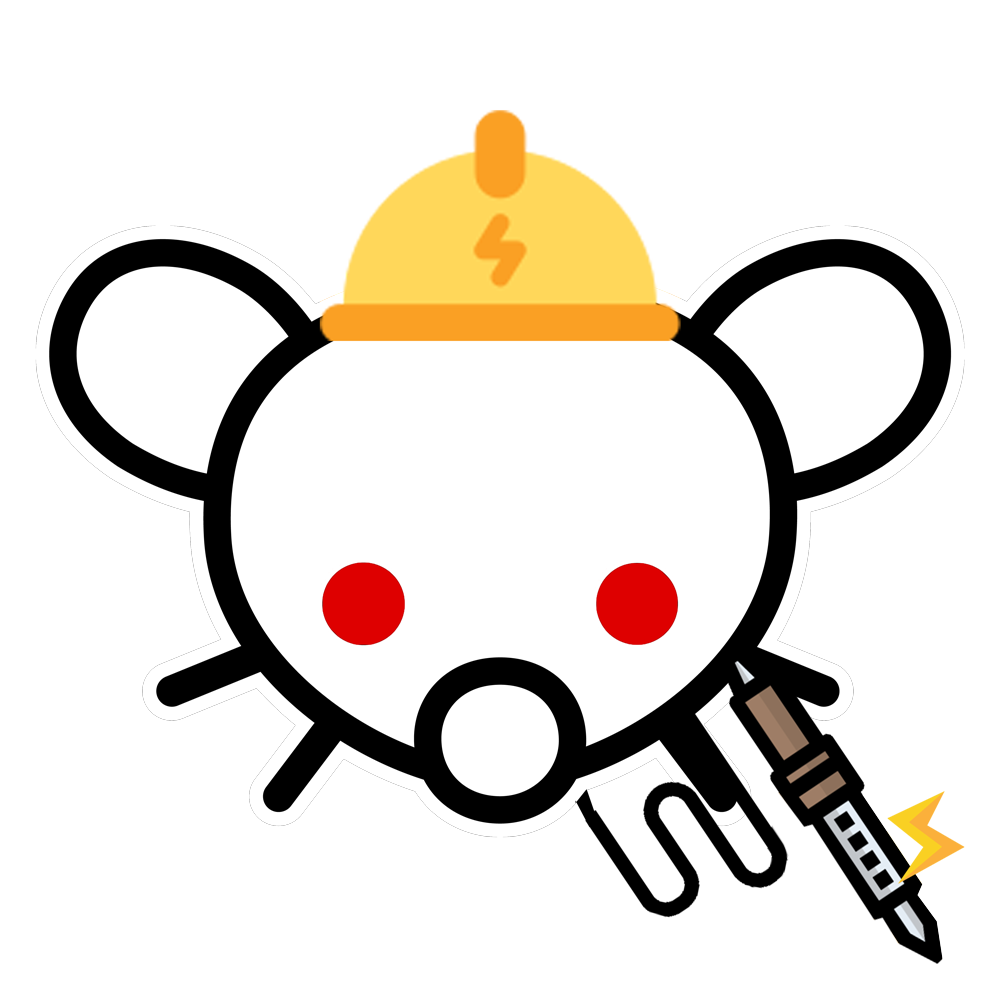


Maybe give the tool and helmet a white outline too: easier identifiable
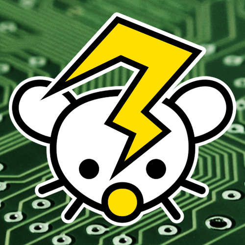
and another idea would be to mix into the question mark an electrical spark but that are only some random tired ideas.
That are like the only things i found to edit, not sure if it is improvementIf your soldering iron is sparking, you have a big problem
I added a couple more. 👍
Thanks all. I’ll leave it a week and then gather the submissions for a poll.
PLEASE ADD YOUR ICON DESIGNS TO THIS POST, INCLUDING ONES YOU HAVE POSTED IN OTHER PLACES.
Apologies - things got a bit delayed. I’m now talking to Davide about a poll for a new icon.
Almost anything is better than the alien
SolderSnoo has gone and there’s a placeholder until we get a new icon.
I also had tried making one: https://postimg.cc/Jyq6HCNX
One problem is that the main content should be within a circle. E.g. the soldering iron would get cut off.
Also yes, literally fucking anything would be better than the current one. I don’t know what the admin is doing…


