Hahahahaha, that was a lot of fuss about a different color on the front-wing!
Also the rear wing is blue with no more “Ferrari” on it. There’s also 15 HP logos on the car now
Hey I’m sure Alpine would love those extra 15hp
Lmao take my upvote
Hey hey now, I think the wheel covers might also be blue. Very exciting stuff. /s
Surely everyone should have expected this sort of thing after the yellow(ish) Ferrari a year or two back?
the difference is that the yellowish Ferrari managed to actually look awesome. This just looks like someone painted random parts blue without giving it a real thought.
Yeah, I wasn’t expecting much to be honest, but this is extremely minimal…
If anyone else had their eyes violated by seeing this livery, you can file an ethics complaint against Ferrari here: https://www.fia.com/fia-ethics-and-compliance-hotline
I am having a hard time deciding which of these forms of misconduct this falls under. Alleged violations of the FIA ethical principles or Alleged issues related to sport integrity and/or manipulation of competitions.
Like yeah it seems pretty unethical to make something so bad looking, especially for the Italians. Though at the same time I can see how this livery could be detrimental to the integrity of F1. Also now that I think about it they could be trying to manipulate the race. It strikes me that any other driver that has to look at this livery. Could easily have their race negatively affected. How the hell are you going to set up a good pass if you are distracted by how terrible this looks.
It is honestly a huge disappointment. I don’t know what I expected.
As bad and lame as their new sponsor’s product …
🤮🤮🤮
Soon they’ll need a HP subscription to deploy DRS
I’m not sure why I expected the livery to be completely blue.
I was expecting a ‘Ferrari Azzurro’ like on the California.
https://www.americanmusclecarmuseum.com/files/cars/thumbs/2015-ferrari-california-t_9238.jpg
Yep, that’s exactly what I had in mind.
Even this would fit much better:
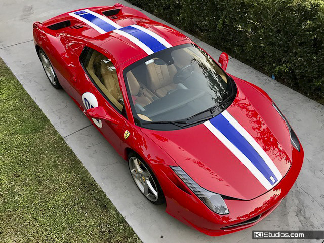
Is this an official Ferrari livery? Never seen this one in any official Ferrari participations. Maybe from a customer team?
Hm, I stumbled upon it, maybe it’s not official indeed
There is something retro about how insanely busy the design is. It’s certainly a vibe but… can’t say it looks good.
HP logos are ugly as sin
Hahaha; I dunno what I expected but this sure as shit isn’t it. Woo… thanks for the morning laugh.
Ferrari: How many HP logos do you want on the car?
HP: Yes
No dinoco blue… sadge
I expected shit, this is worse. I don’t know how they managed to screw this one up so bad.
Anybody remember when Ferrari was whining about no longer having Marlboro as a sponsor, because Marlboro fit with their color scheme. Yet they’re willing to do this? Weirdly enough I feel like both circumstances put them on the wrong side of History.
Daring today
After seeing the teaser I wasn’t expecting much, but this doesn’t look too bad.
I quite like it
Go stand over there.
how dare i /s

