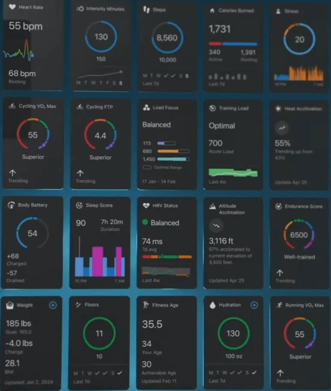
I still hate the activity summary screen. The old design, with some basic numbers in the three circles in the middle beneath the map, looked great, had better information density, and looked unique. The new one looks bland and generic, and has oodles of wasted blank space.
It saddens me that somebody over at Garmin got actually paid designing that.