I’m a big fan of solar panels but the alignment could’ve been better!
My website after I fail again at CSS ^
you cant go any closer to the skylight or you’re gonna punch holes in the flashing and it will leak.
But they did on the other side? And holes are holes (he said) so all of them need to be sealed.
I have tried to explain that to my wife a hundred times.
They usually attach a steel structure to the outside of the roof, then they attach the panels to those.
That should give them all the freedom they need to put the panels wherever looks good.
omg thank you.
Why is that mildly infuriating?
if I had to guess, probably the lack of proper alignment.
Ohhhhh… I thought it was going to be the chimneys apparently held in place with duct tape.
I think it’s lead cladding.
It’s lead flashing which I think is used to protect the joint between the chimney and the roof.
Haha, very well may be. I know nothing about that stuff. I guess I should have said “appears to be duct tape”. Blowing the picture up it is definitely not that. It’s definitely metal flashing of some sort.
Yeah I’m not exactly a roof/chimney sealing method aficionado either lol. Could be some nonsense my brain threw up.
That’s not duct tape, that’s lead cladding
Not the panels themselves but the alignment of the top left two panels.
Ah! Gotcha, that is a little annoying.
for me its the top left panel being partially shaded. thats going to really reduce its functionality.
You could even say it’s… mildly infuriating.
Mildy, yes
It would really irritate me if I had to look at it for the next 25 year 😂
Based on the comment with the image, the alignment of those top two panels compared to everything else being uniform.
deleted by creator

The variable kerning is a really nice touch.
Comic Sans or Papyrus font would have been a nice cherry on top.
I’m not a deisgner and you pissed me off…
Add a stretched photo somewhere in there.

…wait a second… are you just trying to get me murdered by a mob of angry designers?
P erfect!
ocd, you’ll like this
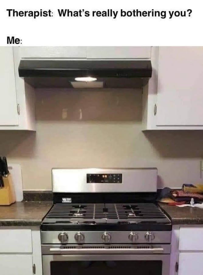
Look on the bright side. You can place the plunger right next to the stove and it has space to stand.
It does like a little annoying, but since I’m not a roofer or solar panel installer I feel like there’s probably a reason for this that I don’t know.
There is. They have to be installed on the rafters/trusses and the skylight is in the way of being able to put them all on the same rafter/truss.
They’re usually 16 inches in center so moving over one rafter would put that row off by 16 inches. They probably have the panel installed as far to the end of the support track that they can so it’s only a little bit off instead of a full 16 inches.
Too credible and reasonable an answer, downdooted

hell, i think it’s cool. maybe the upper left set of squares could move right a couple inches, but they look good!
i just watched this post get: 1.65k, then 1.5k, then 24, then 5, then 64, and now 5 upvotes… how?
It’s a lemmy glitch happens a lot.
thanks thanks. I just thought it was a bot swarm
Stupid lemmy. Making me think my posts are blowing up, when really it’s 2 upvotes. Just like my trash OC on Reddit.
I’m hearing the Tetris music but it’s on a cassette that’s slightly aged and is slipping a bit.
This is like adding an image to a word document.
"hi! I’ve added your picture
spoiler
piiiiiiiiiiiiiiiiiiiiiiiiiiiiiiiiiiiiiiiiiiiiicccccttttttttttttttttturrrrrrrrrrreeeee
next to the text you wanted!"
What’s wrong with it?
I think he is talking about the difference between the left and right window margins.
I’d it really not equidistant on both sides of the skylight? < twitch >
Absolutely criminal


