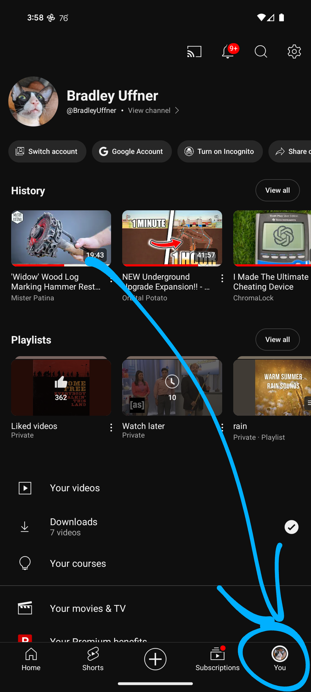
You can’t remove things from it, you cannot rearrange it… Useless things and suggestions get stuck at the top.
I’m on Android 13. Have they made any improvements in the newer versions of Android?
You can’t remove things from it, you cannot rearrange it… Useless things and suggestions get stuck at the top.
I’m on Android 13. Have they made any improvements in the newer versions of Android?
When UI/UX was becoming the hot ticket in the late 90s/early 00s, the lesson always beaten into your head was to make navigating simpler, with the fewest clicks possible. Now they bury everything.
YouTube used to let you make playlists on the fly, now you have to click into a small sub menu that is hard to touch without stopping the current video. Even disconnecting from a network is now an extra click than it used to. Google designers have totally lost the point. They are the reason people pay more for less with an apple phone.
Don’t even try to find your YouTube music or video play history in a rational way. It’s in your profile! W T F .
It’s literally one click, and I found it first try…
Break it so they can take credit for fixing it