Great info. Awful website design. Thanks for sharing this.
I’m reading on a phone and I really thought the article style was cool. Maybe it was novelty but I liked that I could scroll quickly through it, or I could click on each data point.
I also think it’s cool, but it traded away the basic usability of knowing if swipe down is doing anything or not.
A simple page progress indicator along the side would restore that, and plant this firmly in cool.
(And it did!)
Seems like they added one
Nice!
All seems too harsh. On mobile it was OK, probably made it easier to scroll through and read the whole thing without adhd kicking in.
Agree, just make a static site. on mobile I had to keep scrolling multiple times to make all the animations happen
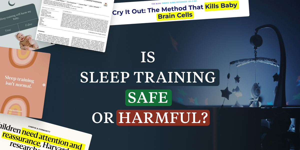
Tldr research shows it isn’t but some people don’t like it and misuse / misquote studies that dealt with constant neglect / stress and apply them to an hour before the kid falls asleep and is crying.
When my partner and I started discussing sleep training, we were wondering whether it was a neutral choice for our son (like using formula or a pacifier)
What a strange thing to say. Both have been shown to have a number of disadvantages.
The fact that there’s not a lot of data supporting the notion of sleep training being harmful is interesting, but still: What a way to start an article about scientific thinking.
This might be my favorite post in this community to date.


