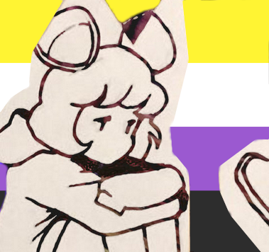
Take for example my banner image. On mobile you can see Isabelline standing at the opening of whatever the fuck that is, looks great. Roughly a 16:9 window, maybe 1.85:
On desktop she is cut out  scope asspect ratio looks awful. Mods pls
You must log in or register to comment.
