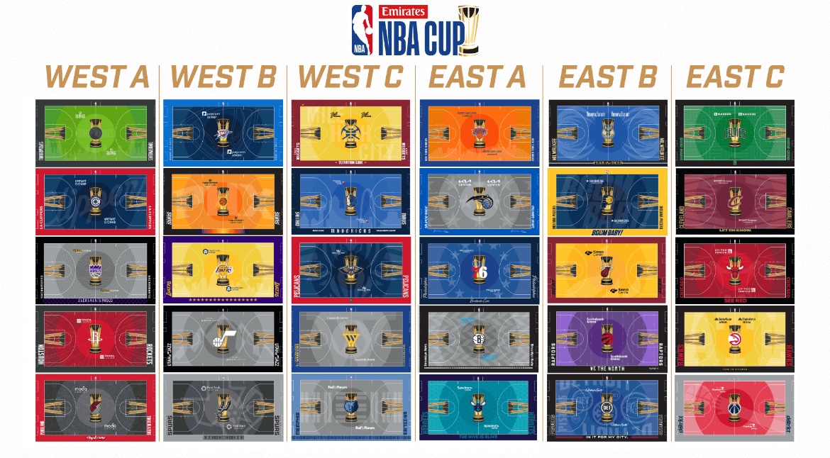
This years designs are below organized by the groups, what does everyone think?

Link since the pic with all of them isn’t the easiest to see some of them.
This years designs are below organized by the groups, what does everyone think?

Link since the pic with all of them isn’t the easiest to see some of them.
Some are pretty nice but the top left one (think it’s the pelicans) is terrible with that green.
Wish the bucks wouldn’t go with blue, don’t like their blue jerseys either.
The Bucks blue is always weird (their yellow was even worse imo), but I think the antlers on the court look a lot better than whatever shadows and text and clipart are on the rest of them.
That top left is TWolves. Not pretty