When using Large post view, posts with a url show that url including thumbnail below the post content. But when opened, the link is above the content. I’d prefer it to be below, so that the 2 look similar—I find it a bit of a visual glitch that the order jumps. Is there a way to do that (couldn’t see one), or could it easily be added?
This is actually something that I had changed in a recent update. Links used to be shown below the post content when opened. I found it to be somewhat odd to have the subject of a post appear below the post content, especially for larger posts where you might have to scroll to see the link preview at all. Additionally, post images are shown above the post, and it seemed inconsistent to show links below.
I’m working on redesigning the large post layout, as well as the open post view. Though I haven’t quite decided how to address this. I was thinking to omit the content preview for link and media posts in the posts feed, and then move the post title to the top of open posts. This would provide consistency in the 2 views. Like I said though, I haven’t fully decided yet. I’m definitely open to suggestions.
I actually really like the preview in large feed—the link thumbnail expanding to full screen is really good, so I do hope that can stay. My only suggestion, from UI design scars of old, is anytime you’re not sure, make it an option :)
For example, I like this layout:
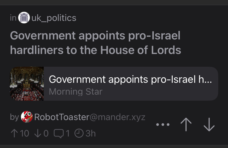
But then opening could easily look the same, but it ‘jars’ a bit to this:
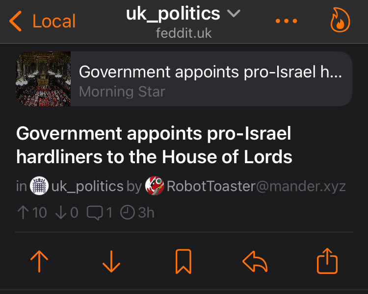
And I prefer the first tbh. I don’t mind the link being way below if the content is long; I tend to read the post before going to the link anyway.
Oh, and if you do make this configurable, a search feature in options is almost certainly going to be on the list before long too :)
By omitting the content preview I was referring to the post body excerpt in the posts feed

And then in the open post, I would move the title above the link or media preview, and append the post body below like this.
This would make it appear as though the large posts cell was expanding from its current state.
I may do this either way, and just add an option to move the link previews to the bottom of the post. I’m not sure if I should do the same for post images and videos though.
By the way, I did add support for searching setting a few versions back. It’s not fully comprehensive yet, and will not show deeply nested settings, but it does show most options.
Ha—I’d not noticed the pull-down in settings. But I haven’t changed anything for ages either…
I do also like the preview in the main feed—short posts don’t even need opening then which is much easier, especially one-handed.
That’s a good point, for now I just added a new setting in the appearance section for placing links above or below the post. I’ll keep working on the updated layout. I’m half tempted to make a customizable layout that you can drag and drop elements where you want them to appear, but that’ll have to be part of a larger update.
