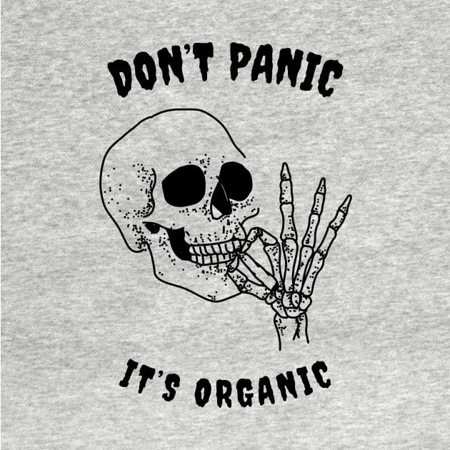
Fun! Good job on the graphics bizzle
Only constructive criticism I can think of is there should be more contrast with the text its hard to read as it goes through the head/hat.
As an experiment it might look cool to swap the green background with sky and clouds like your flying ✈️
I want extend the idea to 🍄 craft artisian cubes lol!
You could put a light colored stroke (border) on the lettering to make it more legible. Doesn’t have to be super thick or bright, just enough to define the edge of the letters.
Do the proven old trick of simply outlining your text in contrast color.
Increases readability means, and it no longer matters what background color you choose for varieties.

Fun! Good job on the graphics bizzle Only constructive criticism I can think of is there should be more contrast with the text its hard to read as it goes through the head/hat.
As an experiment it might look cool to swap the green background with sky and clouds like your flying ✈️
I want extend the idea to 🍄 craft artisian cubes lol!
I agree about contrast 🤔 sky/cloud background would be sick! I ordered a green T-shirt with this logo on there that’s why it’s green 😂
If you make one I want to see it for sure!
You could put a light colored stroke (border) on the lettering to make it more legible. Doesn’t have to be super thick or bright, just enough to define the edge of the letters.
Do the proven old trick of simply outlining your text in contrast color. Increases readability means, and it no longer matters what background color you choose for varieties.