I have a quick question about buttons that toggle between two states. (Think Play/Pause, or Shuffle/Regular Play.) As the title says, should the toggle show it's current state or the state to which...
Toggles should not exist. They should be check boxes. Checked if “ON”, unchecked if “OFF” with a mouse over tooltip if there is any chance that it’s ambiguous.
@calcopiritus@starman
Buttons/switches trigger an immediate action, whereas checkboxes usually do not (such as on a settings page, where no changes are applied unless you click “save”).
Toggle buttons are not normal buttons, they are toggles. Which have the same functionality as check boxes. They are a toggle between 2 states. The only difference is visual.
If they toggle more than 2 states, (like a discrete slider), it is the same as a drop-down menu.
Some widgets are the exact same as others, where the only difference is their visual representation.
Again you’re talking about switches. The thread is about normal buttons which have 2 states (the example being given is a button which can be a play button or a pause button depending on the current state). Buttons aren’t like check-boxes, switches are. A button triggers an event, check-boxes don’t. e.g. on a settings page, you tick all the check-boxes you want first, then click on the Save (or Cancel) changes button - one event for multiple changes. You don’t tick a check-box to start playing something, you press a play button (which in this case would then change into a pause button).
In my opinion, any button in terms of graphical UI design simply dispatches an action with no arguments regarding state. There doesn’t exist a dichotomy between a “toggle” mechanic and a “standard” button as far as the button itself is concerned.
Whether or not you want to update the visual representation of that button is a separate concern.
The case that undermines your point is icon toggles, since they don’t need a label, but a checkbox does. For example, dark mode icon buttons: They usually show sun or moon icons, which hits OP’s point: if your in dark mode, and the button shows a moon, that would make sense – except the button doesn’t put you into dark mode, at that point it puts you into light mode, so, shouldn’t it show the sun?
In the specific case of a dark mode, it doesn’t matter since the whole aspect of the app changes. You could not label the individual states and it’d be fine.
Also, as soon as you add another theme it does no longer work, for a theme selector you need a drop-down selector which lists all the themes.
That’s true, you can’t really miss what’s happening with a dark mode switch – it’s not like it’s a “charge me $50 extra for insurance on my shredded wheat” button.
The theme selector tho – while rare – IDK, that doesn’t have have text – it probably should, for the same if a11y, but you can indicate the theme with an image; the one I made for a project recently uses the image itself on the button.

Toggles should not exist. They should be check boxes. Checked if “ON”, unchecked if “OFF” with a mouse over tooltip if there is any chance that it’s ambiguous.
@calcopiritus @starman
Buttons/switches trigger an immediate action, whereas checkboxes usually do not (such as on a settings page, where no changes are applied unless you click “save”).
Never said nothing about a button. Toggles are just check boxes with a different aspect.
EDIT: the thread is actually about actual buttons. Maybe should’ve clicked on the link where it explains what he means by “toggle button”.
This whole thread is about buttons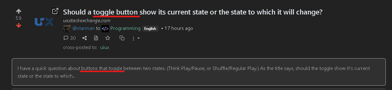
Toggle buttons are not normal buttons, they are toggles. Which have the same functionality as check boxes. They are a toggle between 2 states. The only difference is visual.
If they toggle more than 2 states, (like a discrete slider), it is the same as a drop-down menu.
Some widgets are the exact same as others, where the only difference is their visual representation.
Again you’re talking about switches. The thread is about normal buttons which have 2 states (the example being given is a button which can be a play button or a pause button depending on the current state). Buttons aren’t like check-boxes, switches are. A button triggers an event, check-boxes don’t. e.g. on a settings page, you tick all the check-boxes you want first, then click on the Save (or Cancel) changes button - one event for multiple changes. You don’t tick a check-box to start playing something, you press a play button (which in this case would then change into a pause button).
Yeah you’re right. Didn’t see it was a crosspost and infered from the title.
That’s ok. Thanks for being big enough to admit you were wrong - these days a lot of people aren’t!
In my opinion, any button in terms of graphical UI design simply dispatches an action with no arguments regarding state. There doesn’t exist a dichotomy between a “toggle” mechanic and a “standard” button as far as the button itself is concerned.
Whether or not you want to update the visual representation of that button is a separate concern.
The case that undermines your point is icon toggles, since they don’t need a label, but a checkbox does. For example, dark mode icon buttons: They usually show sun or moon icons, which hits OP’s point: if your in dark mode, and the button shows a moon, that would make sense – except the button doesn’t put you into dark mode, at that point it puts you into light mode, so, shouldn’t it show the sun?
In the specific case of a dark mode, it doesn’t matter since the whole aspect of the app changes. You could not label the individual states and it’d be fine.
Also, as soon as you add another theme it does no longer work, for a theme selector you need a drop-down selector which lists all the themes.
That’s true, you can’t really miss what’s happening with a dark mode switch – it’s not like it’s a “charge me $50 extra for insurance on my shredded wheat” button.
The theme selector tho – while rare – IDK, that doesn’t have have text – it probably should, for the same if a11y, but you can indicate the theme with an image; the one I made for a project recently uses the image itself on the button.
deleted by creator