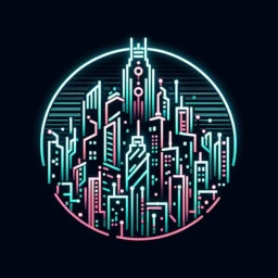
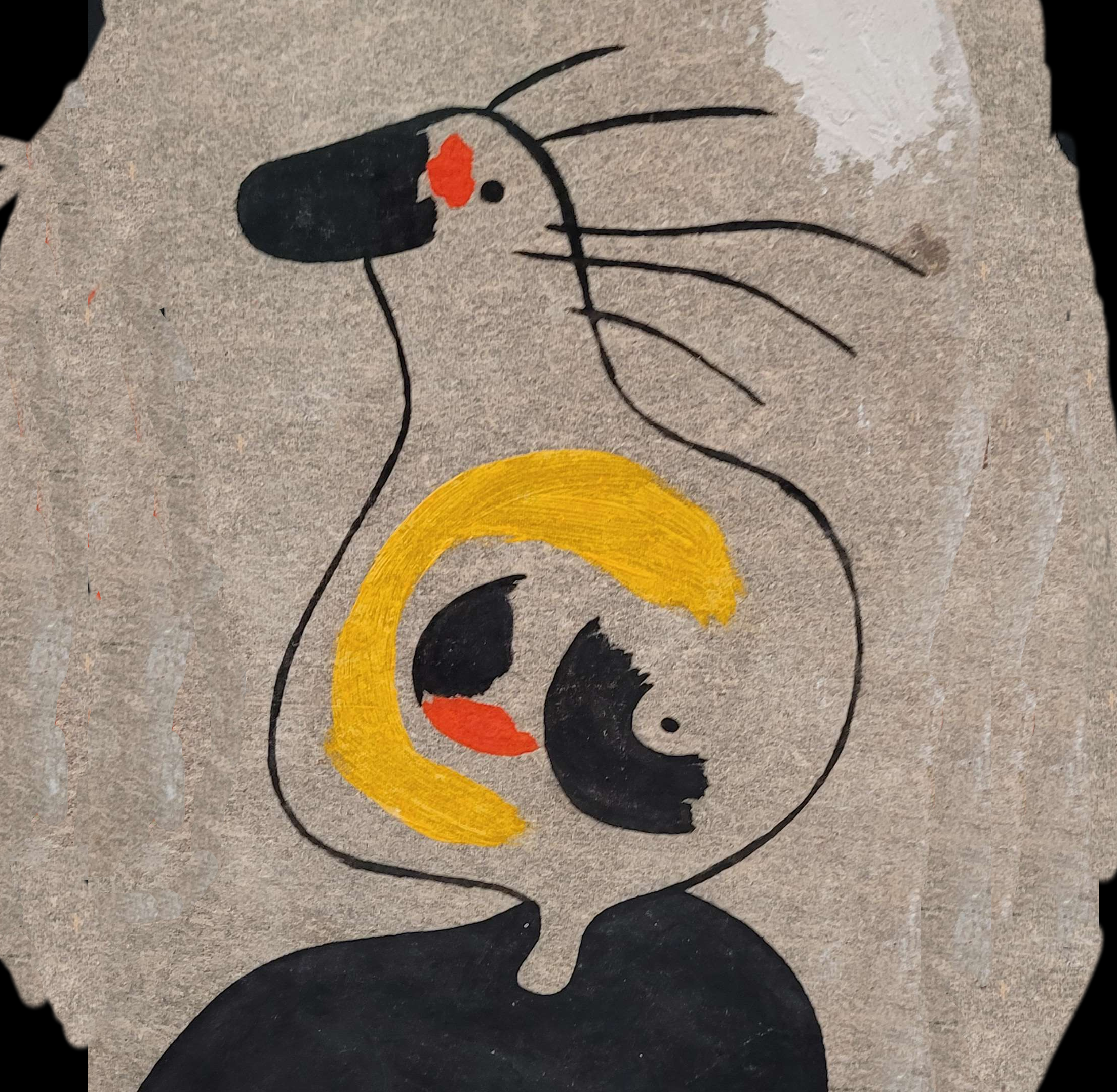
This community currently has a banner and icon generated by AI. That’s all well and good, and I like the amorphous blob of neon skyscrapers used in the banner. But I don’t like the icon. My problem is that when you shrink the icon down to the size used in all apps, those two orange neon signs end up looking like flippers on a neon pinball table to me.
Unfortunately, I’m not artistic enough to make an icon on my own. So I thought maybe I could open this up to the community and see if any of you are artistic enough to make one for me. Or competent enough in photoshop to throw something together. Or maybe you can give more direct AI prompts to make something specific for this community.
I’m open to any designs you think might work, but my idea was to take the Lemmy logo and add like a pink or green mohawk on top and futuristic visor covering the eyes. Something that’d be both “cyber” and “punk” but hopefully distinctive enough to still be recognizable when shrunk down to icon size. And I’d rather avoid any references to specific cyberpunk works since this is a community for the cyberpunk genre in general, not a Blade Runner or Ghost in the Shell community.
One last thing. I didn’t want to make this a separate post but I’ll be on vacation all next week. I know no one really cares, but I’ve been trying to post something every day and if a week goes by with no new posts, I don’t want anyone to think I disappeared or gave up on this community. I’ll be back next week with more random nonsense to post each day. EDIT: (I’m back from vacation now)
Enjoy your vacation!
Thanks!
I’ll see if I can come up with something! And thanks for the heads-up for next week
I’ll be on vacation all next week. I know no one really cares, but I’ve been trying to post something every day and if a week goes by with no new posts, I don’t want anyone to think I disappeared or gave up on this community. I’ll be back next week with more random nonsense to post each day.
Been there fam, I gotcha back.
Thanks for all your help keeping this community active!
Yeah no problem, I was posting daily to !gothindustrial@lemmy.world for a while and got someone to take over for a week I was offline.
I think that’s the key to growing these smaller sub-lemmys: at least 1 person posting regularly and a couple others posting when they can.
I had some fun with the inpaint and prompts. Apparently inpaint can take output image as an input and here are some iterations.
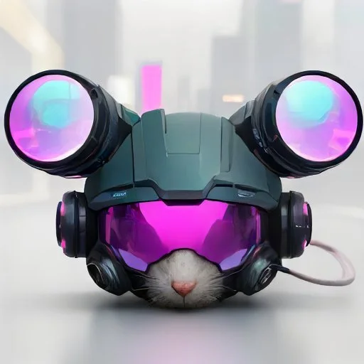
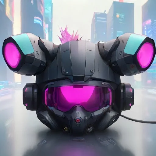
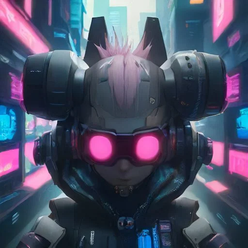
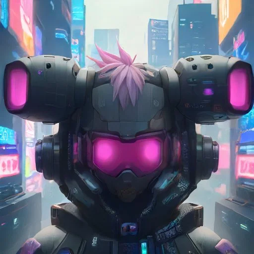

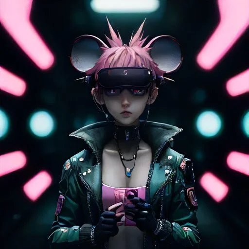

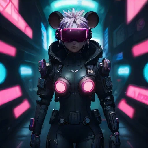
Those are all far out. My vote’s for the first one bc it looks good zoomed in as well as shrunk down.
I’m torn. The first one looks too much like a flight helmet than a cybernetic visor but would still be recognizable when shrunk down. The later pictures (with the girl) look much more cyberpunk but have too much detail for them to look good when shrunk down to icon size. Also, the ears get a little too “Mickey Mouse” in those full-body pictures.
Honestly, the fourth picture (last one before she gets a body) looks the most cyberpunk to me while still not having too much detail. Hmm…
This was a ten minute play with leonardo.ai, feel free to try something yourself.
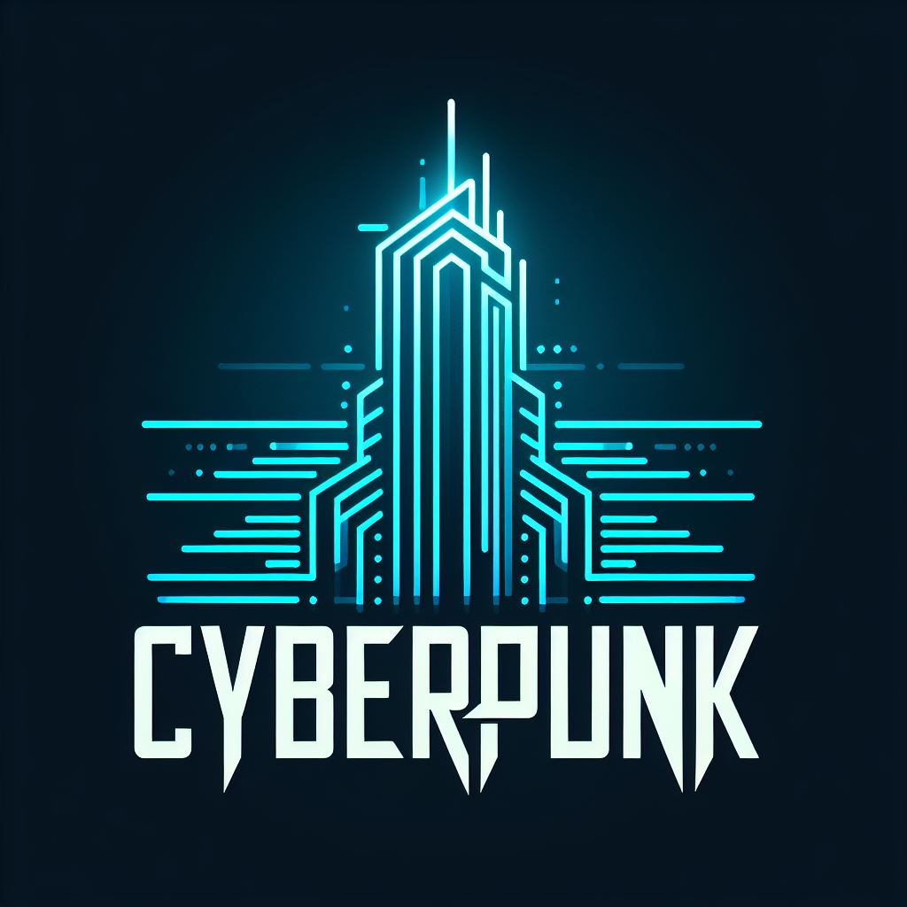
More abstract:
More colourful:
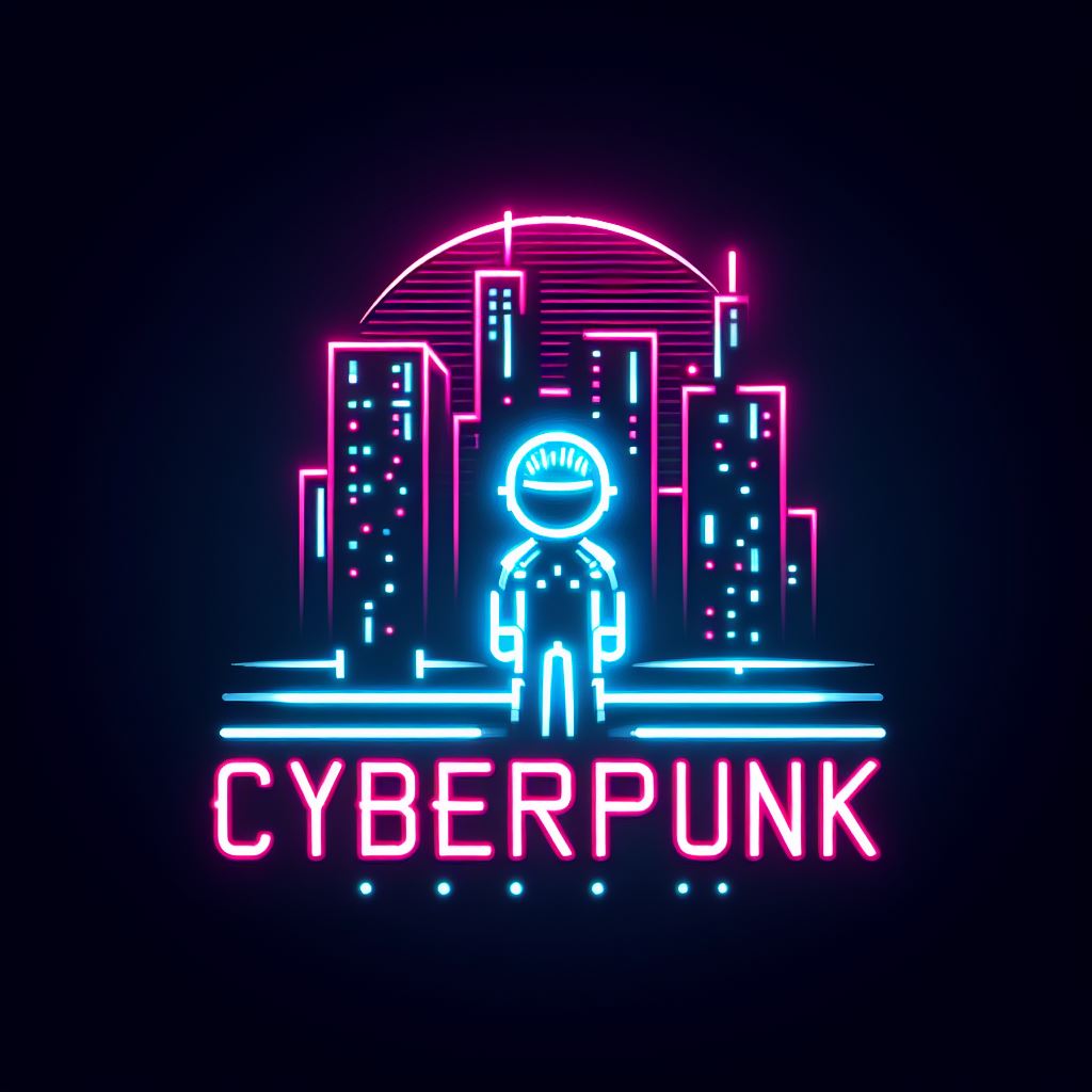
While I like the abstract nature of these, my main priority is to make them look good at icon size. So I’d rather not have any words on them. Can you create some without any text? That colorful one might actually work pretty well, although I worry it’s treading a little too closely into Outrun territory:

How about this?
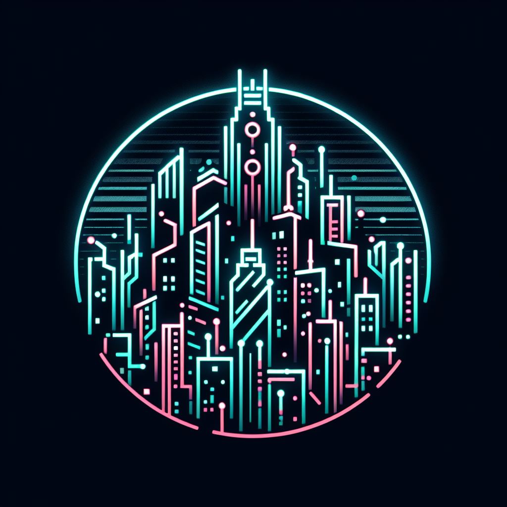
Awesome, nice work!
This icon won the vote! Good job!
Hi Hammerjack. Please feel free to change your community icon any time when you find a better one. I only did it for fun and didn’t expect to “win” honestly.
Added credit in the community sidebar. Thank you.
Hi BrikoX, please feel free to change your community icon any time when you find a better one. I only did it for fun and didn’t expect to “win” honestly.
