ThisLucidLens
✨ 3D Artist and trainee psychiatrist. Imagination unleashed. 🧠
🎨 No AI, now or ever. All work is my own creation using Blender.
💖 DM me for commissions.
🌐 Explore my other socials, buy me a coffee or purchase prints: https://linktr.ee/ThisLucidLens
- 13 Posts
- 37 Comments
Thanks, this is actually super useful feedback because I’m not much of a photographer myself. I used the default Blender 35mm film with I think a 35mm lens at F-stop 10.0. The scene used real-world scales
From what I could find online an F-stop from 8-16 seemed to be an appropriate range for those sorts of lenses, but would you have any other insights? Quite an easy thing to fix for sure but I’m definitely lacking knowledge here
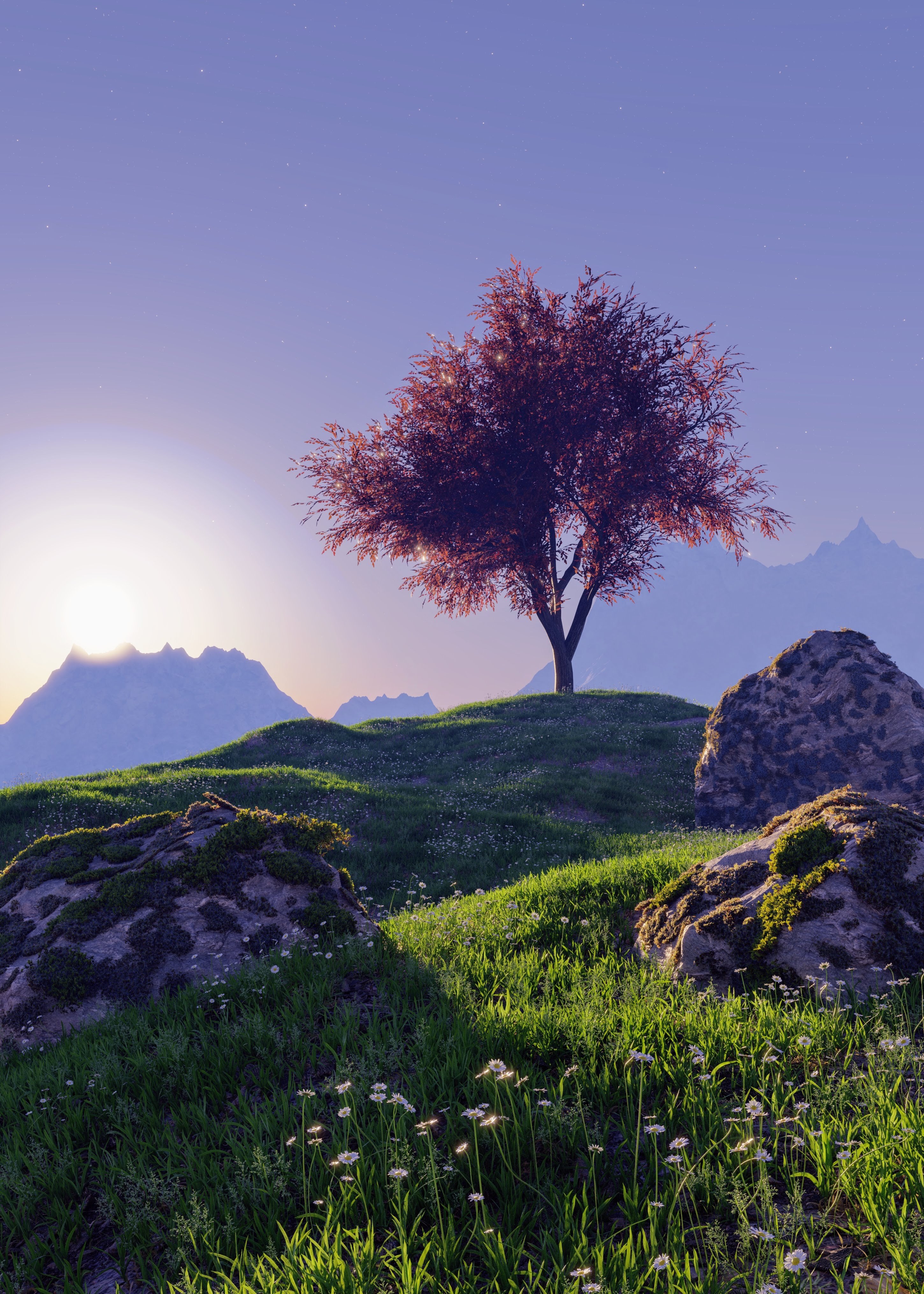
And here’s the original one I made back in 2020 😊
 1·2 months ago
Thanks! ✌️

 8·2 months ago
 Here’s the original which I made back in 2020 when I was first starting out 🙏

 3·3 months ago
Of course, always happy for people to use my art as wallpapers 😊 I’ll probably forget to message you but once I’ve worked on it a bit more, I’ll probably do another post. So if you keep an eye out you can use the finished version

 1·3 months ago
Before I did it the other way round, and I’d start building the scene and model things as I went. The main issues with doing it that way round were that modelling became slower as the scene got more detailed (so eventually I’d give up making new things), and I also ended up modelling a lot more things because I didn’t really reuse assets as much.
This may all seem like common sense and it’s probably how most people work, but up to now my process was always building staff when I needed it rather than making a load of assets in advance.

 2·3 months ago
Thanks! Post processed in Photoshop but not drastically. A bit of a levels adjustment, some film grain and some colour grading, otherwise it’s not too different from the final render

 1·3 months ago
Thank you! 🙏

 2·3 months ago
So actually less than you might think. Maybe 12 hours in total? I was actually trying a different workflow this time which really suited me - I pre-made a lot of assets and then effectively kitbashed my own scene from them. There’s a lot of repeated elements which you don’t really notice with the lighting, etc (unless you really peak close up)
 3·7 months ago
Okay but for all you know he could be murdering a child murderer

 2·8 months ago
Thank you!
Now that you’ve mentioned foreground contrast I can see it and completely agree. I think when processing the photo I probably did the easy mistake of cranking the contrast a bit high - gives it a nice punch but loses some of that shaded foreground detail. Good to keep in mind for future projects though 🙂
And I usually post here when I make something new, so I’m sure you’ll see me crop up again!

 2·8 months ago
It was inspired by it - I actually only found out about the competition after I saw the compilation video, so decided to see what I could do with the stairs concept 🙂
Didn’t use the project assets though, built my scene from scratch so it might differ slightly in proportions, etc

 2·8 months ago
Took me a couple of days, around 18 hours total. A lot of that time was spent playing around and tweaking things because I didn’t actually go into this fully knowing what I wanted to create

 3·8 months ago
Sure!
All the foreground stuff was modelled first, then sculpted with rock textures / general wear (posts, steps, cliffside, etc). The giant spires were sculpted from a cube. Textures are mostly procedural, a few texture maps but I prefer doing things procedurally as I don’t have to worry about UVs and seams. The vegetation, moss, ivy, trees, etc were scattered using a few add-ons (Baga Ivy, Geo-Scatter). The landscape was made with noise textures and masking in TT5 add-on, then sculpted slightly afterwards to get the exact shape I wanted. I used the same add-on to texture the landscape with masks. The clouds and fog are all volumetric using noise textures, and the human is built from the HumGen add-on which I made to resemble me (it’s a good way to watermark my art - hard to remove digitally, distinctively me and less intrusive than a big logo or something).
Hope that makes sense. Happy to answer any other questions if you have them 🙂

 2·8 months ago
Thank you 😊

 3·8 months ago
grumbles “and the lift is still broken… hate these shitty stairs… 350th floor flat was a stupid idea…”

 1·8 months ago
Thank you! Man Myst was such a great game

 2·8 months ago
Thank you, the details are my favourite parts to do
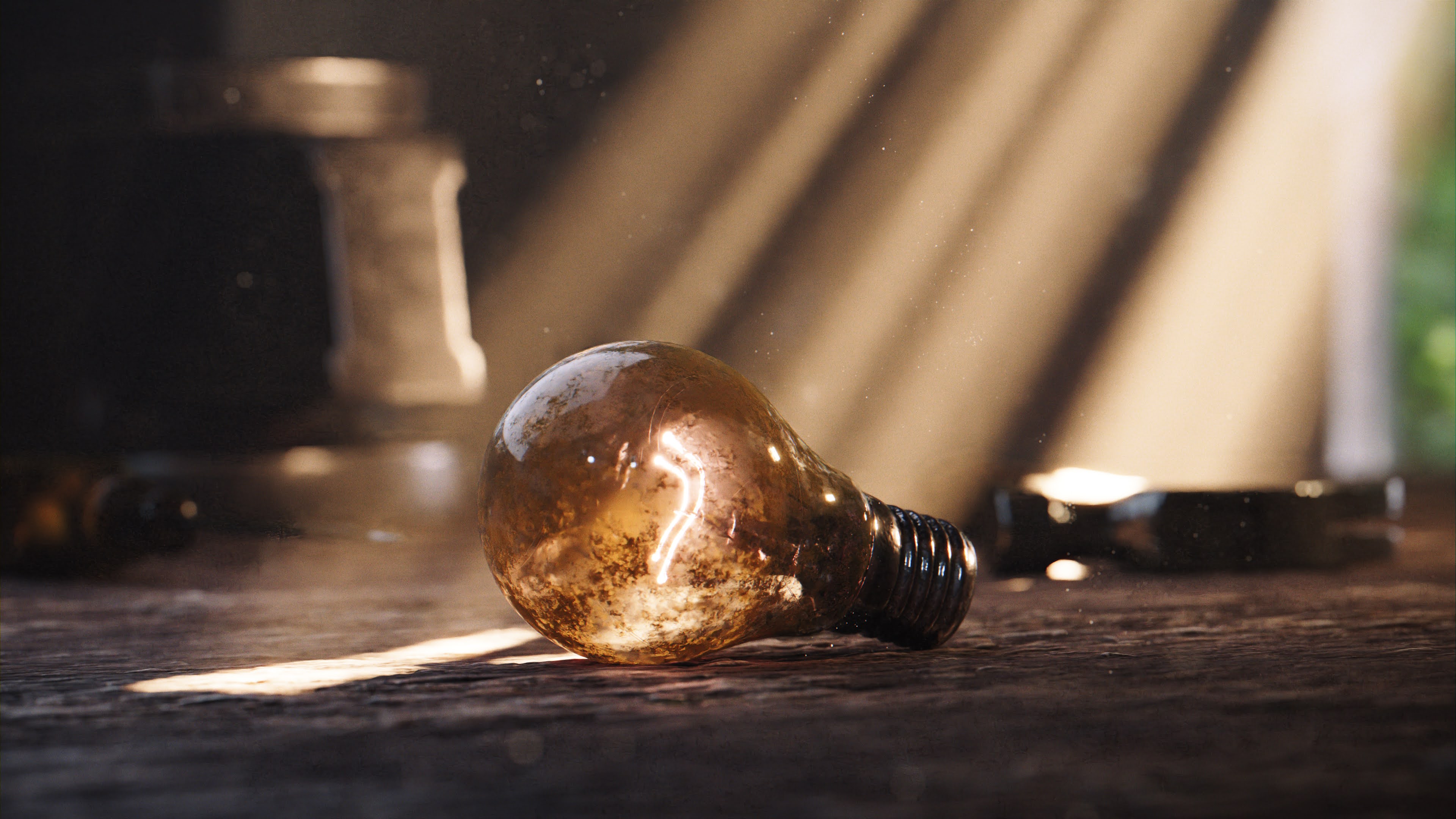

The mist was a cube volume with density driven by a couple of noise textures.
The vegetation was done using Geo-Scatter addon with various assets I’ve downloaded (I think most were Grassblade from Bproduction). Then just a lot of tweaking of masks, ecosystem settings, abiotics, etc driving different density and scale values.
If you don’t already have Geo-Scatter, it’s a phenomenal add-on for nature scenes - I would so highly recommend it, and their documentation is great too