Hello everyone,
Haven’t deal with my dashboard for a long time so want to take advantage of some recent features like visibility condition (not sure that’s proper wording) to create a new clean adaptive phone and tablet dashboard, but missing inspiration so curious how yours looks like. How did you organised it? which card (also card combination) is your favourite?


I’ll just re-share mine from last time.
I tend to use the Horizontal Stack. On a mobile device, I just get one stack per line.
And on bigger screens, I get multiple stacks to make use of space.
General “Going out” page:

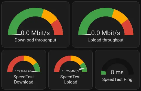
Internet speedtest page:

Thanks