My man Lawson the only one out there obviously drawing his own logo. Respect!
For a second there I thought I was in dank. Lawson is real? 🤣… temu graphic design…
For a second there I thought I was in dank. Lawson is real? 🤣… temu graphic design…
Checo now doing driver logos on Fiverr
Gonna be honest, I don’t like most of these. Half of them look like low budget RGB Gamer Headset brands or eSports brands to me.
They don’t really remind me of racing, besides Carlos’, which I like. Retro styling, two white lines on the sides just like a track, italic to give a sense of speed and forward movement. A good logo that reminds me of motorsport. If you put that logo on an F1 car from almost any era, it wouldn’t look out of place.
I also like Lando’s because the use of negative space is pretty cool.
Lewis’ is, I guess, classy. It’s subtle and it integrates well into helmet designs. Wings and the face of a panther. The problem is I only recognised it as such once it was pointed out to me, so I’m either stupid (and I won’t rule that out) or it’s a little too subtle.
Bortoleto’s I like, although it kinda looks like they took Bentley’s logo and changed it enough to not cause legal issues lol
Hulkenberg’s logo is to be read in Danny Ric’s voice.
Bearman, the man with a picture of a bear
I think the bear’s cheeks are an O B, but still pretty funny he went so literal.
Hulkenberg clearly put a lot of artistic effort into his.

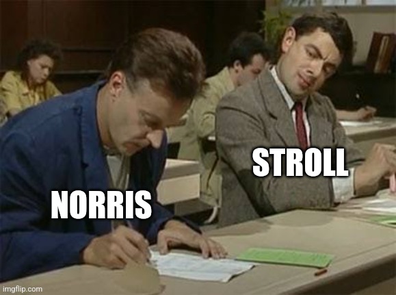
I like Norris’s, neat use of negative space.
His and especially Oscar Piastri’s which looks a lot like a racetrack
How unique 💀
Props for the Lawson.Bit too strong Van Halen vibes from the Gasly one.


