
I share it even though it’s not very good only because I’m using internet as a my journal lately. lol. I hope you don’t hate it too much!
I share it even though it’s not very good only because I’m using internet as a my journal lately. lol. I hope you don’t hate it too much!
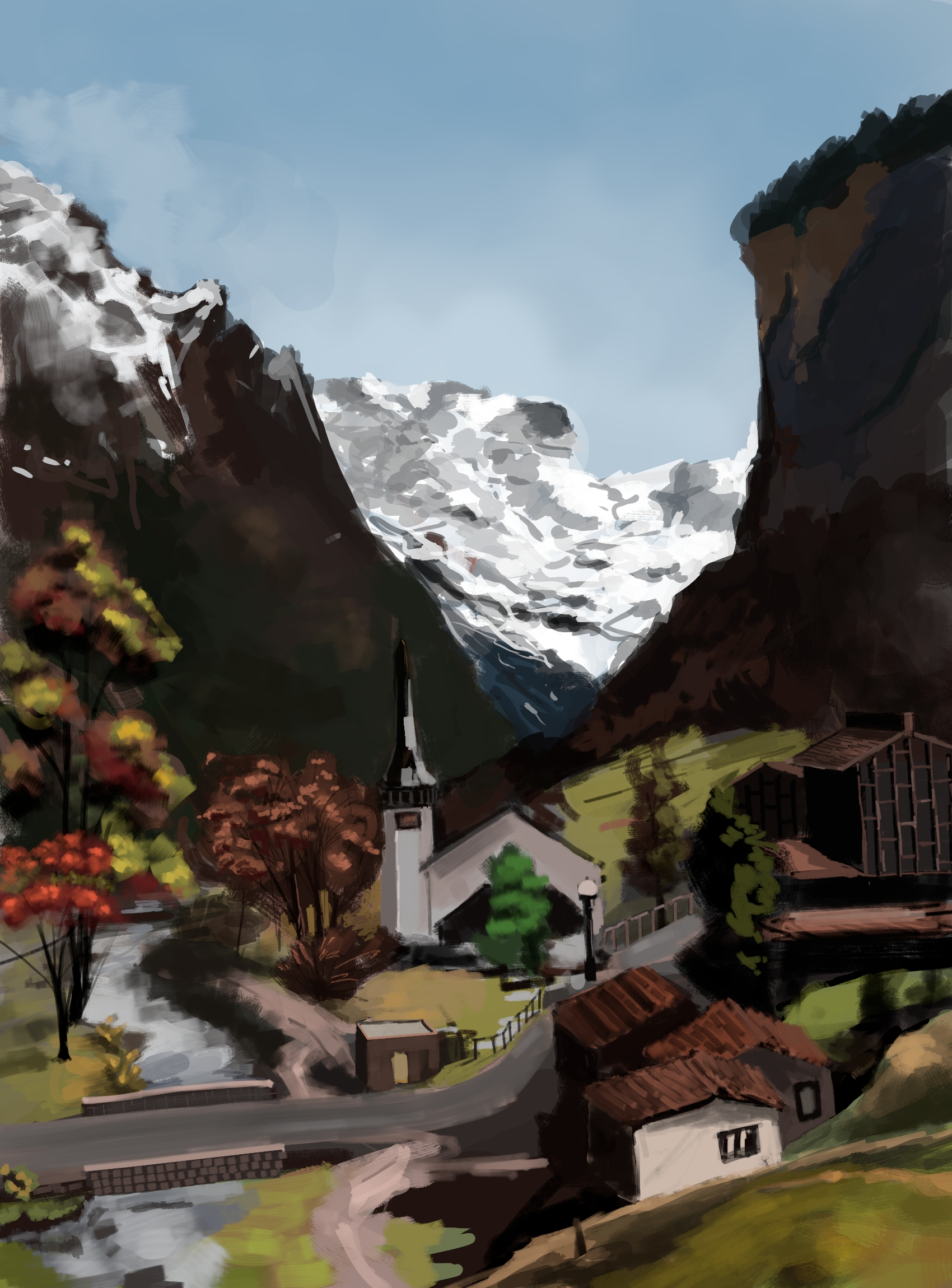
I like this! I like it a lot, and I’d be proud to have painted it. The general aesthetic appeals to me, and I’m particularly fond of the left half of the valley. I love the color work, how loud the highlights are against the darker colors without being offensive to the eye; it’s a very visually striking style.
Only read if you want constructive feedback:
If I had to guess what’s “wrong”, I’d say that it’s that the detailing over distance is inconsistent. You’ve got some things that are sharply detailed at a far distance (the church) and other things that are loosely detailed at that same distance (the trees). The line work also seems a little wobbly (speaking as someone who does vastly worse line work). The last thing is that the very far off snow is really, really, really bright, which seems to suggest to the eye that it’s much closer than it ought to be.
I agree with you assessment. Consistency in detail is an issue here. I changed my mind few times while painting it, whether to make the details loose or closely knit.