


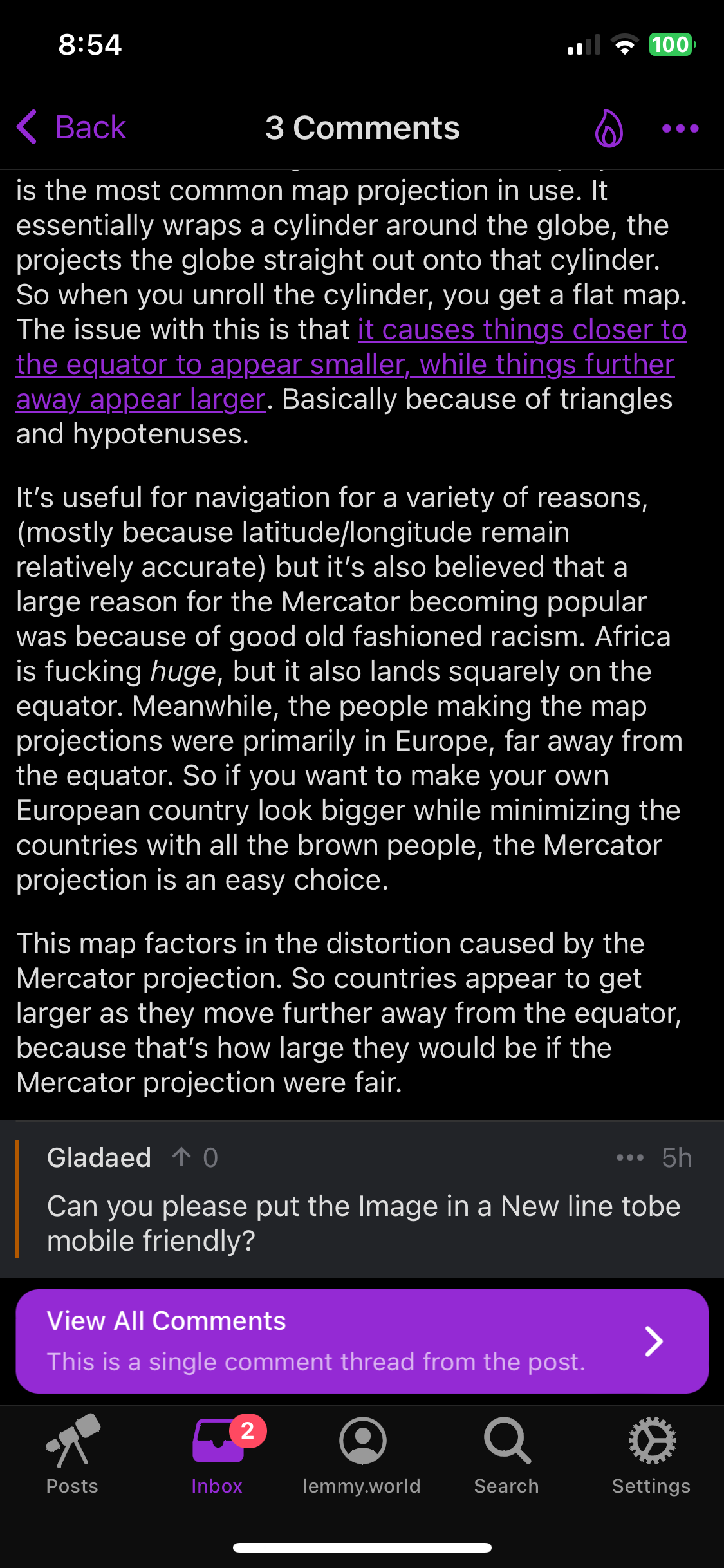
For those who don’t get it: The Mercator projection is the most common map projection in use. It essentially wraps a cylinder around the globe, the projects the globe straight out onto that cylinder. So when you unroll the cylinder, you get a flat map. The issue with this is that it causes things closer to the equator to appear smaller, while things further away appear larger. Basically because of triangles and hypotenuses.
It’s useful for navigation for a variety of reasons, (mostly because latitude/longitude remain relatively accurate) but it’s also believed that a large reason for the Mercator becoming popular was because of good old fashioned racism. Africa is fucking huge, but it also lands squarely on the equator. Meanwhile, the people making the map projections were primarily in Europe, far away from the equator. So if you want to make your own European country look bigger while minimizing the countries with all the brown people, the Mercator projection is an easy choice.
This map factors in the distortion caused by the Mercator projection. So countries appear to get larger as they move further away from the equator, because that’s how large they would be if the Mercator projection were fair.
Edit: You fuckers get a link instead of an image, since apparently some apps haven’t figured out how to parse images.
The advantage of mercator irc. Is that it is true to angle. Hence navigating by coastline is much more practical. You can choose one property to be preserved when choosing a transformation ans angles seem more useful to me, too.
but it’s also believed that
Yeah, got a source for that not involving Tumblr 😂
Come on, there’s absolutely no fuckin way a map projection would’ve become popular if it wasn’t easier for explorers
*shakes fist* DAMN YOU PYTHAGORAS!!
Can you please put the Image in a New line tobe mobile friendly?
I’m curious about which app you’re using, because
This is in Sync:

And Jerboa:

Better now?
Now it’s a link instead of an inline picture :).
Texas still is bigger than the world amen god bless
