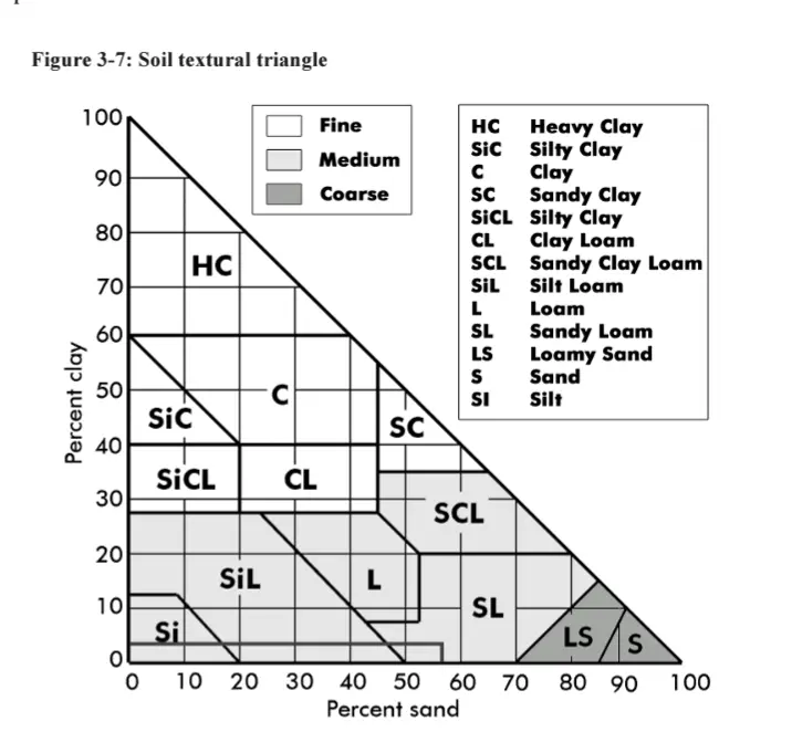
I think I get it. The arrows on the labels show the direction to read, but aren’t actually by the percentage the represent. Sand percentages are on the left, silt on the bottom, and clay on the right?
This chart would benefit from color coding the lines and moving the labels and arrows to the values that you’re supposed to read.
Not quite. Clay is on the left. Its numbers go from 0 on the bottom left to 100% at the top point and are the flat ones that are horizontal. Silt is on the right and start 0% at the point and go to 100% in the bottom right. Its lines are the diagonal ones that go down and to the left. Finally sand starts with 0 on the bottom right and goes to 100% on the bottom left. Those lines go diagonally up and to the right.