

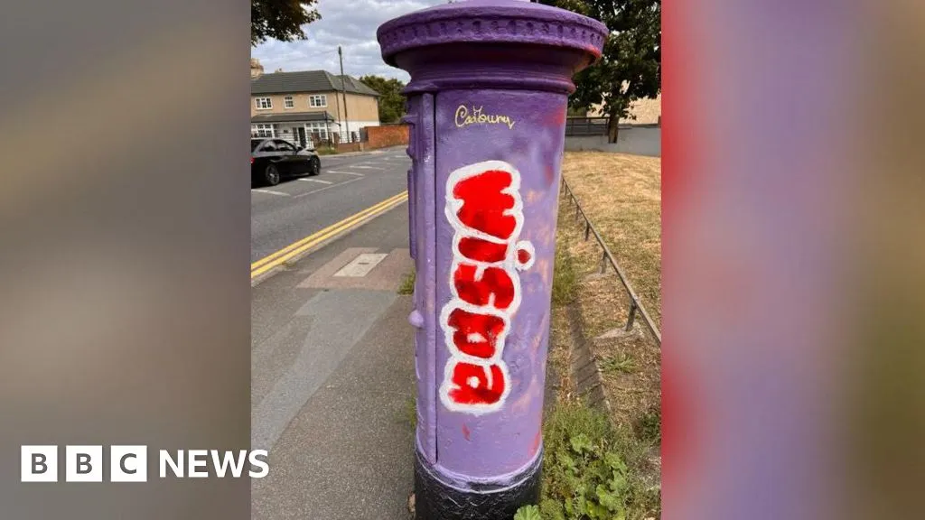
Royal Mail have alerted police after postboxes in Kent were vandalised just six months after they were spray-painted like Mr Blobby and Creme Eggs.
Royal Mail have alerted police after postboxes in Kent were vandalised just six months after they were spray-painted like Mr Blobby and Creme Eggs.
Need it or not is a very personal opinion.
After all a red cylinder vs a green cuboid is hardly a clear design winner.
At least be honest and admit nostelga is really the main difference.
Of course. The definition of what is ugly and what isn’t is subjective and nostalgia obviously plays a part in that.
But I think it’s quite fair to say that almost nobody would consider a postbox to be an eyesore. It’s a functional design but it also has aesthetic elements to it which exist purely to make it look nice, and it’s doing an okay job at that.
Contrast to a telecom utility box which is purely functional, a rectangular box coloured in a drab gray or green in the hopes that our eyes might just wander over without noticing it is even there. Intentionally avoidant because nobody wants to see it.
So I very much stand by my opinion on which “needs” painting and which does not.
Fair.
I wonfer if you are old enouth to remember the early utility boxes.
They were dark green made from much thicker metel. And had over hanging tops similar to postboxes but rectangular.
Been a good couple of decades since I saw one. But they were more shapped little recess in the double doors etc.
My guess is privatisation made the uriliries consider price and replacability over asthetics.
If so. Thar dose not bode well for posr boxes.
Post boxes are painted the way they are for two reasons. The first is to make them easier to see, the second is to clearly identify them as a post box. For the second reason, it’s also important they all look the same.
This is a pretty stupid take, to be honest.
PS they dont all look the same. Many in shop walls while they have the same colour and basic design but flat.
There were loads outside larger post offises that were black boxes with 3 slots. (From when 3 classes of mail existed.
The first is and was common in villages where pavements were to narrow. But you are correct they were of a design that was reminisant of the piller.
The bigger ones really were a huge acception. Other then shape i have no idea why they abolised the look.
Not sure when they were built. May have been something to do with the 60s design ethos. As I can only remember the late 70s on.
So the exact thing the vandal has altered?
I gave 2 examples. One that in no way keeps that design.
And my comment was in no way supporting the work. Just questioning if the excuse that op used that they were more attractive then other boxes.