
You must log in or # to comment.
I don’t understand how to read the top one.
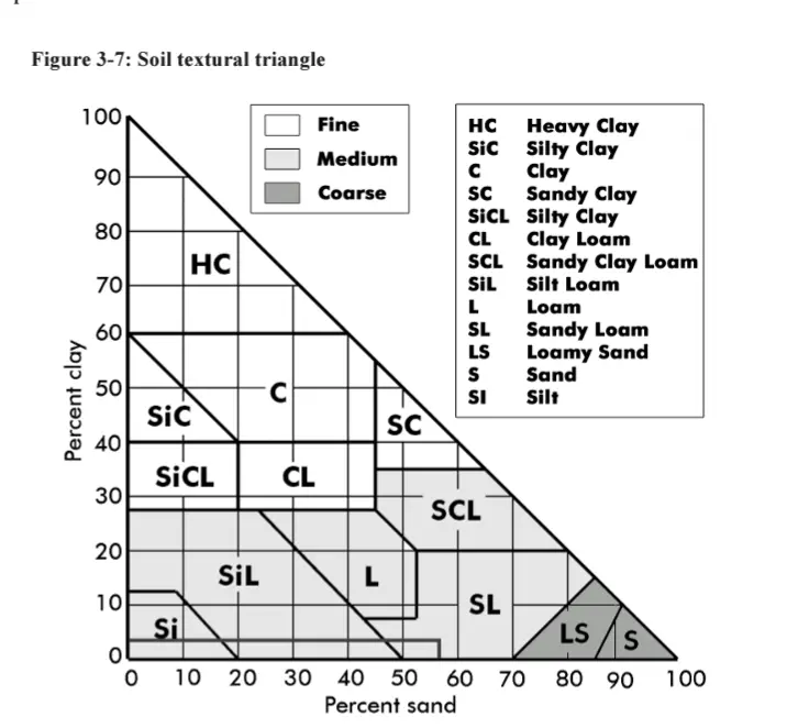
So the “a” in “loam” in the middle-bottom, it’s at an intersection of 3 lines. If I follow those lines to each side I see that loam is 60% clay, 40% silt, 60% sand, and 40% sand.
Ok, maybe I’m not supposed to follow the grey lines, but the cardinal directions? To the left, loam is 20% clay, to the right 80% silt, and below 50% sand.
The more I try to understand this chart the more confused I get.
Follow the orientation of the numbers. On the left, horizontal lines. On the bottom SE to NW lines (\) On the right, NE to SW lines (/)
So, loam is 20% clay, 40% sand, 40% silt.
You need a second backslash character for one to display. Currently the \ isn’t displaying.
Fixed thanks!
Oh shit, make sense now. Thank you!
the link is !soilscience@slrpnk.net
some info:
the equilateral triangle (US) one is confusing as fuck, if you’re uninformed. Basically, start with two lines, and see where they take you (e.g., 30% clay, 40% sand). The third line tells you what the remaining percentage of the 3rd textural size is (e.g., in this case, silt).
In the Right angle Triangle (Canadian one) sand and clay to derive your texture. silt is implied (e.g., solve for ‘x’).

gravel gets counted later, and classified as coarse fragments.
Didn’t realize there was one unique size for gravel. I’d call gravel anything from slightly bigger than sand to bit smaller than a golf ball.
Bruh, there’s tons of different sizes for gravel and coarse fragments:

Right that’s what I mean! Your first graph made it seem like there was just that one size. That table is super interesting thanks.
Haha, check out my soil science community. There are rabbit holes (and pictures of holes!) A-plenty there
Took me a while too. The left numbers “clay” are the gray lines that are flat (left to right), the right numbers “silt” go top-right to bottom-left and the bottom numbers “sand” go bottom-right to top left.
The intersection of any point is the sum of the 3 numbers and always equals 100. So for example, to get “silty clay loam” (middle right side). You follow the 30% for clay line, then the 60% for silt and finally 10% for sand. Those three equals 100%.
I kept doing what you were too and could not understand why I kept getting over 100% until someone else explained it to me.
I think I get it. The arrows on the labels show the direction to read, but aren’t actually by the percentage the represent. Sand percentages are on the left, silt on the bottom, and clay on the right?
This chart would benefit from color coding the lines and moving the labels and arrows to the values that you’re supposed to read.
Not quite. Clay is on the left. Its numbers go from 0 on the bottom left to 100% at the top point and are the flat ones that are horizontal. Silt is on the right and start 0% at the point and go to 100% in the bottom right. Its lines are the diagonal ones that go down and to the left. Finally sand starts with 0 on the bottom right and goes to 100% on the bottom left. Those lines go diagonally up and to the right.
deleted by creator
From my understanding, the grey lines are for the silt and clay axis, the sand axis is just read vertically and there are no lines.
Learned about this from dwarf fortress.
That was my immediate thought.
How come clay isn’t 100% clay?
It has to do with classification of the soil type. Soils with high clay content function similarly in regard to the soil chemistry and in most fields: hydraulic flow. Soils with such a clay component to be designated as just “Clay” will have consistent structure characteristics and act as a restrictive layer.
Geotech class was great for a bunch of graphs that made you go WTF in what they were trying to show in a way that made sense visually.
The lab was really fun, though.
deleted by creator
For a tank you mainly want it out of a water table. They should be watertight settling chambers.
Now your SSAS, your drainfield, where effluent is being applied to soils you’re going to want sands and as little clay as possible. More importantly than soil type aside from excessive gravels is the intended application rate of effluent into the soil.
A larger drainfield applying effluent at a slower rate becomes more necessary as the soil type gets more smaller particles.
Check out !soilscience@slrpnk.net You want loam or coarser textured soils for septic tanks.
How can clay loam be 30% clay, 70% silt and 50% sand?
You’re reading the chart wrong, you have to follow the axis lines that match the angle of the numbers
I think I see what you mean, but really then you’re only ever looking at soil made up of two types. Clay loam could be 30 clay / 70 silt, or 60 clay / 40 sand, or 30 silt / 70 sand. That doesn’t make sense, because you could also, for example have a 30 clay / 70 silt in the sandy clay loam or silty clay loam regions - the 3rd thing is supposed to tell you where along the line you stop, yet whenever you do that you have 3 percentages that add up to more than 100%.
Maybe you wouldn’t call it 50% sand, and instead pick one of the sand diagonals to get a point in the clay loam region, but no matter how I look at it the percentages don’t add up.
No I think you’re still misunderstanding. For example, here I’ve chosen a random point in the clay loam section of the chart. We can follow the three lines to the numbers on the sides of the triangle and see that this clay loam would be made up of 30% clay, 30% silt, and 40% sand. You have to follow the lines that match the angle of the number on the side of the chart you are looking at.
You’re misinterpreting the lines. Each number only corresponds to the line perpendicular to the 100 point on their axis, and each line only corresponds to one number, not the 2 it looks like it connects to.
So for example, if you’re looking at the middle-top point of the “clay loam” category, right above the ‘l’, you get 30% sand/40% clay/30% silt.
*I whipped up a rough layout that better indicates which number goes to which line: https://files.catbox.moe/ljm6ih.png. Would be even better with the numbers aligned more precisely, but it’s not worth the effort for all that.
deleted by creator


