@Emperor@feddit.uk mentioned that we’re now ranked 20th by active users, looking at the ranking site, we don’t seem to have a banner.
There is a sad emoji because of that :(
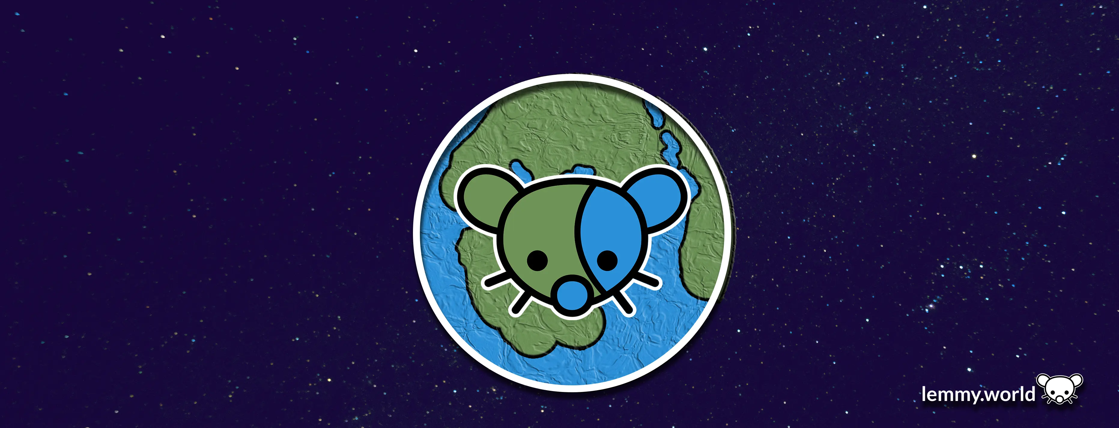
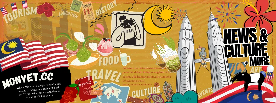
If people are interested, have a go, and post in this thread. You’ll might want to be roughly the shape of this banner from lemmy.world, or this one from monyet.cc. and should try to make it work on both light and dark mode.
Collages are also cool, try to keep any photos free-to-use.
Bonus points if it involves crayons.
You must log in or # to comment.
deleted by creator
Haha, I knew what it would be before I even clicked. Absolute classic of an image.
deleted by creator
Maybe leave the bad teeth out.
I’ll be seeing this banner every day, I don’t want to feel like I’m hanging out in a kentucky hick bar.Otherwise, some twat in a bowler hat, drinking tea, smoking a pipe, with bad teeth would do.
Or sausage fingers?
Lol I love this, until we get a banner which is more “maximalist” which encompasses all aspects of the UK, gonna use this one for the banner!
Some more, of varying seriousness:

Maybe it needs to go one way or the other: Classy landscape (Constable, etc.), or just plain silly.
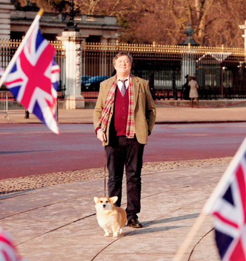
Everything is now locked behind a login (well done Tumblr) but this started with the Stephen Fry image and then there was a relay pasting on other British things. It ended up something like this. It looks terrible but you could take inspiration from that and go for a maximalist approach and Photoshop all sorts of British things together - open the floor for people to suggest and item for inclusion so everyone feels like they’ve contributed to it.
If we had someone around who was more competent at Photoshop, you could do a banner inspired by the Sgt Pepper cover.
One advantage of having lots of stuff in is, if it gets trimmed you aren’t losing any vital element (why text would be a bad idea).
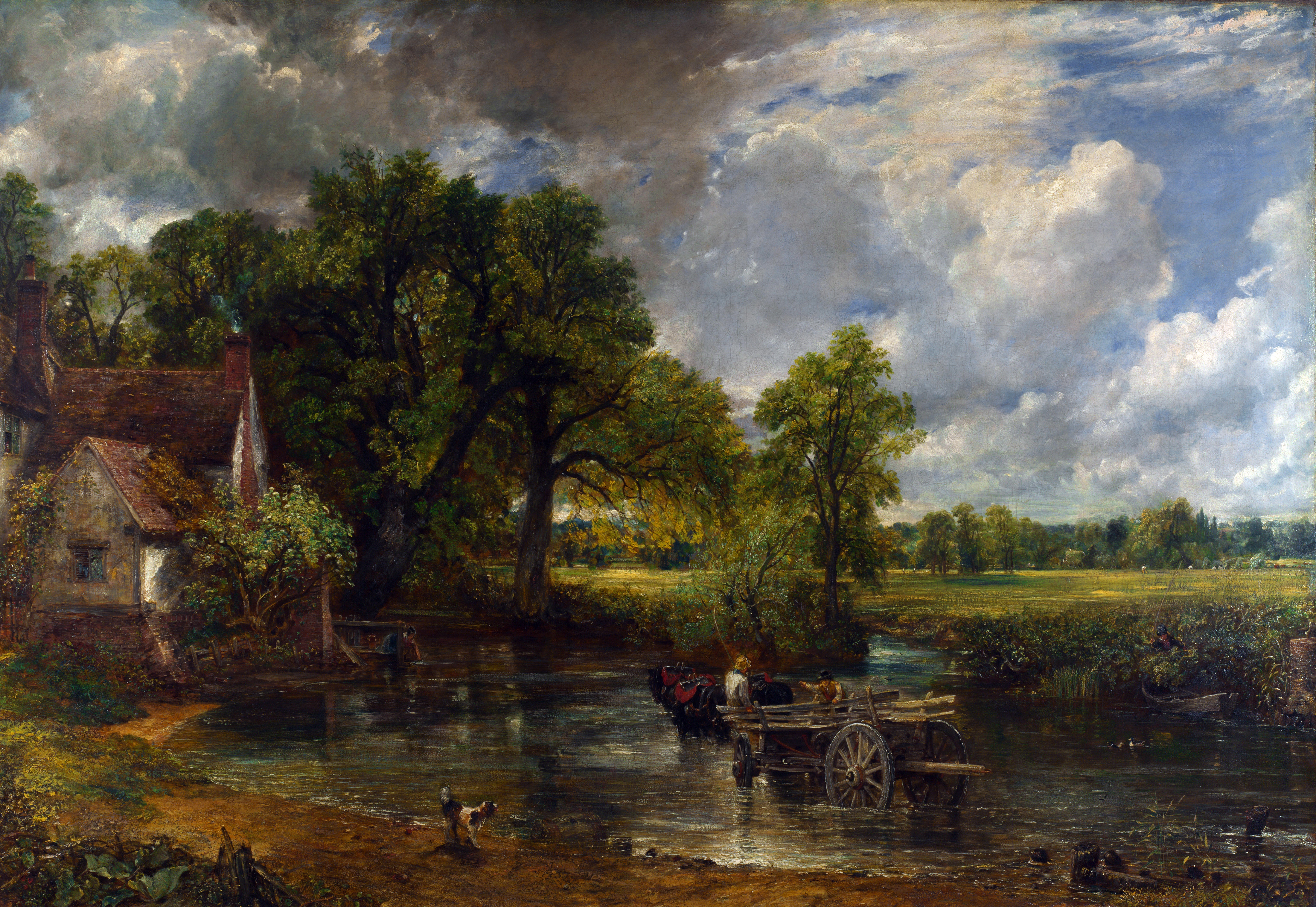
If you wanted something minimalist then Turner’s Rain, Steam and Speed might be appropriate.
That sounds like a good thought, maximalist. Or, as you said, full minimalist.
I will probably have a crack at it, as I’m not too bad with layers. But I’m hoping there is someone ready to “graphic design is my passion” things up in here.
Exactly, I can do most Photoshoppery that would at least look slightly more presentable than the Tumblr effort but someone who knows what they were doing could create something that actually looked nice.
The same goes if anyone can draw - I imagine there’s a need for a few icons around or banners if you were feeling fancy.
No-one is throwing up.
Honestly perfect.
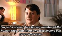
I feel like this quote from Mark Corrigan has suited me well a few times, maybe it’s a British thing. I’m just putting it out there.
deleted by creator
I do quite like this but you’d have to wade through a lot of stuff about our teeth.
deleted by creator
Americans tend not to have the same self-depreciating sense of humour - a morbidly obese, school shooter just hits on different level.
deleted by creator
looking at the ranking site, we don’t seem to have a banner.
I saw this too, thanks for doing something about it - I probably got distracted by something.
It would help us put our best foot forward by giving us our best bib and tucker.
One thing I have struggled with is dimensions/aspect ratio for banners. I did look this up and the advice I found was along the lines of, it’ll resize things, so don’t worry, which is fine as far as it goes but it does mean a banner will display differently.
On the web interface (through Chrome anyway) it goes with the original aspect ratio or there abouts - 1012 x 670 - 2:3 ish.
Liftoff seems to play nice with it:
Through Jerboa it gets trimmed hard:
Which is not the desired effect.
That last image is cropped to 1080 x 265 ish - 1:4
In fact, Liftoff wants a taller banner and starts to get messy when the height is lower:
That looks like it wants an image about 1080 x 683, so about 2:3.
You’ll might want to be roughly the shape of this banner from lemmy.world
This is 3726 x 1425 - similarish to this:
this one from monyet.cc.
This is 1080 x 405 - 3:8
Sooooo, tl;dr - my suggestion would be for a 2:3 banner that works when letterboxed down to at least 3:8 and perhaps even 1:4, although perhaps someone might want to have words with the Jerboa developers as that seems a very restrictive aspect ratio considering it is for mobile phone usage which is usually in portrait.
Format: PNG if possible.
Dimensions: tricky as you don’t want too large a file but some people might be viewing on a desktop. For now, perhaps 1080px wide but keep the original around in case we need it at a larger size.
And, yes, I over-think things.
deleted by creator
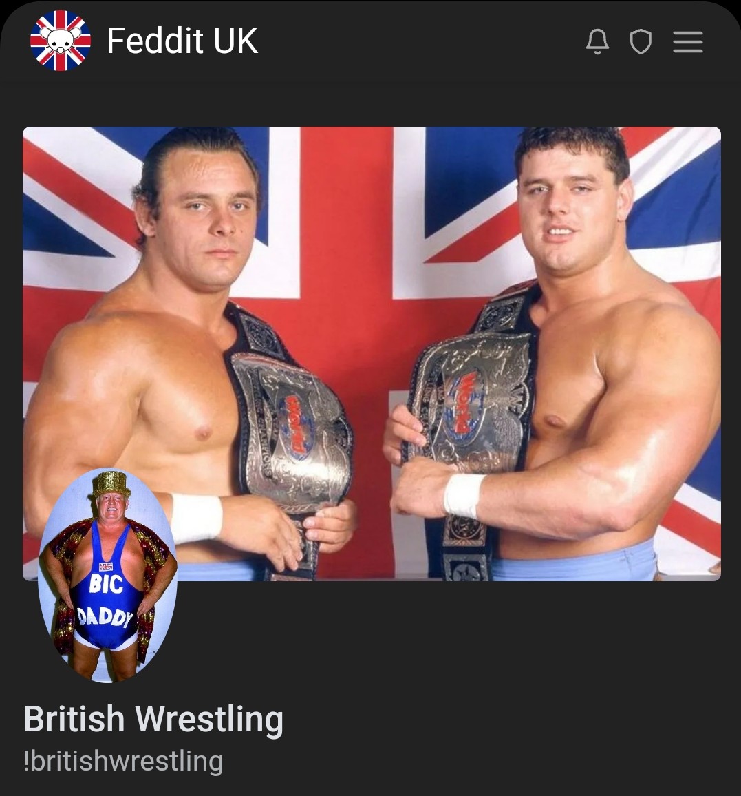
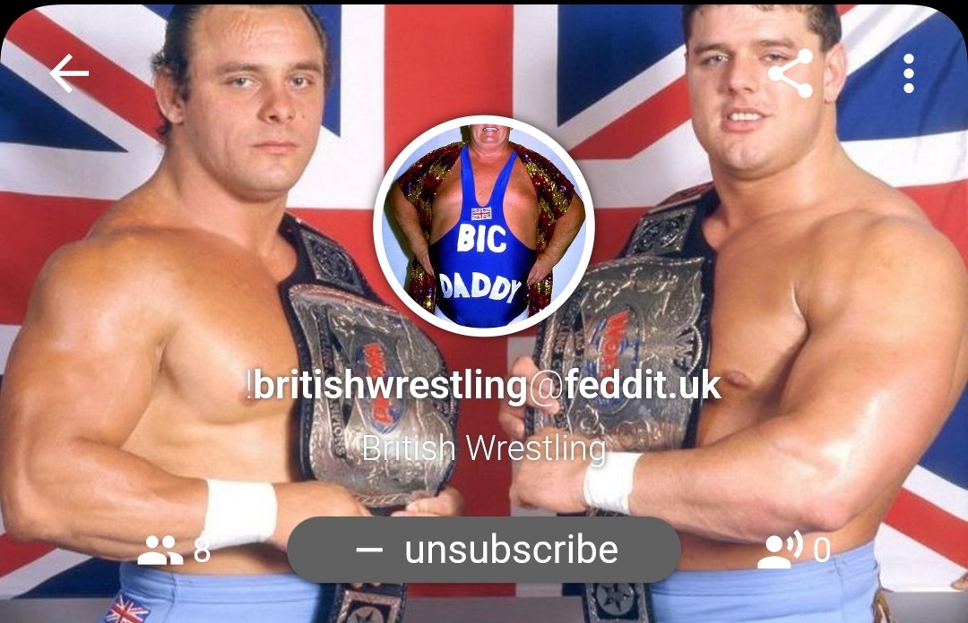
I did consider a photo of both but, with the icon, it’s best to keep things focused and Big Daddy is more iconic and easier to recognise when shrunk down like that (plus it says his name across his belly).