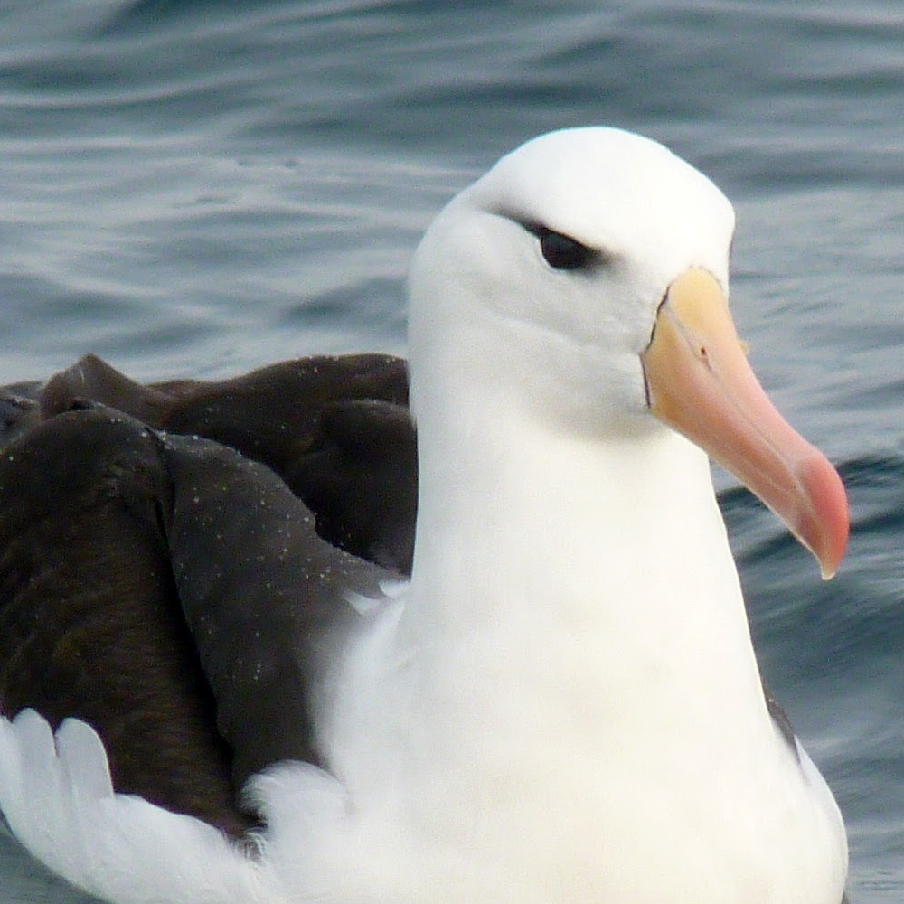
@Emperor@feddit.uk mentioned that we’re now ranked 20th by active users, looking at the ranking site, we don’t seem to have a banner.
There is a sad emoji because of that :(
If people are interested, have a go, and post in this thread. You’ll might want to be roughly the shape of this banner from lemmy.world, or this one from monyet.cc. and should try to make it work on both light and dark mode.
Collages are also cool, try to keep any photos free-to-use.
Bonus points if it involves crayons.


I saw this too, thanks for doing something about it - I probably got distracted by something.
It would help us put our best foot forward by giving us our best bib and tucker.
One thing I have struggled with is dimensions/aspect ratio for banners. I did look this up and the advice I found was along the lines of, it’ll resize things, so don’t worry, which is fine as far as it goes but it does mean a banner will display differently.
On the web interface (through Chrome anyway) it goes with the original aspect ratio or there abouts - 1012 x 670 - 2:3 ish.
Liftoff seems to play nice with it:
Through Jerboa it gets trimmed hard:
Which is not the desired effect.
That last image is cropped to 1080 x 265 ish - 1:4
In fact, Liftoff wants a taller banner and starts to get messy when the height is lower:
That looks like it wants an image about 1080 x 683, so about 2:3.
This is 3726 x 1425 - similarish to this:
This is 1080 x 405 - 3:8
Sooooo, tl;dr - my suggestion would be for a 2:3 banner that works when letterboxed down to at least 3:8 and perhaps even 1:4, although perhaps someone might want to have words with the Jerboa developers as that seems a very restrictive aspect ratio considering it is for mobile phone usage which is usually in portrait.
Format: PNG if possible.
Dimensions: tricky as you don’t want too large a file but some people might be viewing on a desktop. For now, perhaps 1080px wide but keep the original around in case we need it at a larger size.
And, yes, I over-think things.
deleted by creator
I did consider a photo of both but, with the icon, it’s best to keep things focused and Big Daddy is more iconic and easier to recognise when shrunk down like that (plus it says his name across his belly).