Mario got an eye on the landlords?
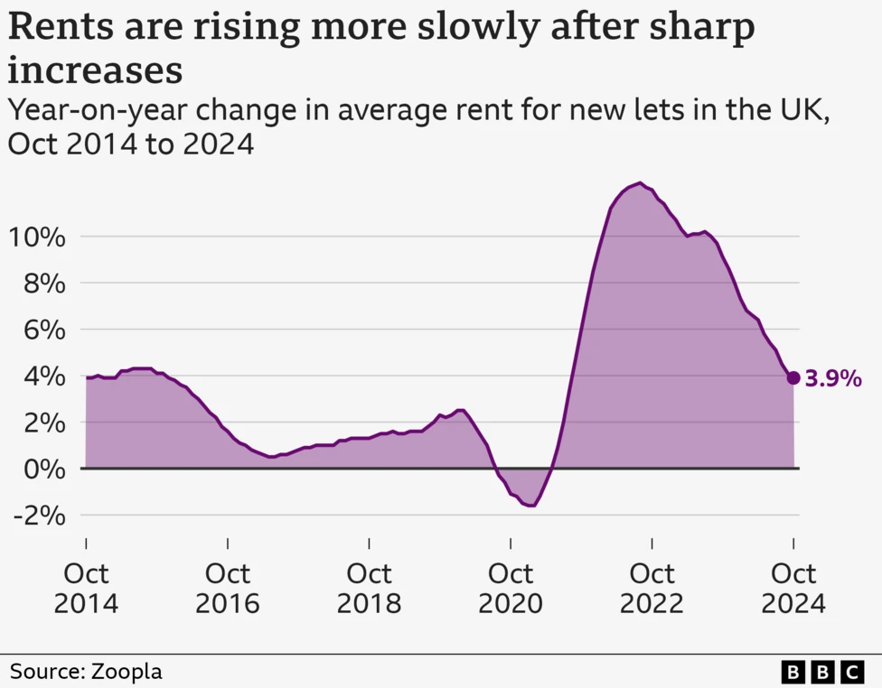
What a disingenuous graph for showing how rent has risen.
This graph shows the percentage increase, not the money increase, so it’s harder for people to comprehend exactly how much it’s gone up. That plummet in 2020 makes it look like rents went down below 2014-2019 levels, but it just stopped rising, briefly.
So a line steadily on 4% would actually mean a constant exponential increase?
I mean it says it represents percent increase year over year. What’s confusing about that?
Because that’s not how people think. They could have done a graph of average rent price and shown it going up, and up, and up. But instead, they obfuscate the statistics so the layman casual reader can’t understand it, that’s better, isn’t it?
There’s a reason they’ve got a section titled Landlord’s Concerns and not one titled Tenants’ Concerns.
My landlord keeps putting my rent up, but so is every other landlord, so despite desperately wanting to move, I have nowhere to move to, because the rents everywhere have become completely outrageous (and even if it’s less than what I’m paying now, I get told I can’t afford it because they demand your income be so many times the rent because guaranteeing a return on their investment is more important than poor people being housed).
Of course this will never change as long as we are ruled by the fucking land and property owning gentry.
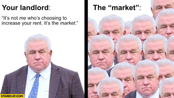
This, but it’s also “the government”.
We could do with a Mario. Keir Starmer isn’t really cutting it so far
